A crafted visual identity for a modern design firm
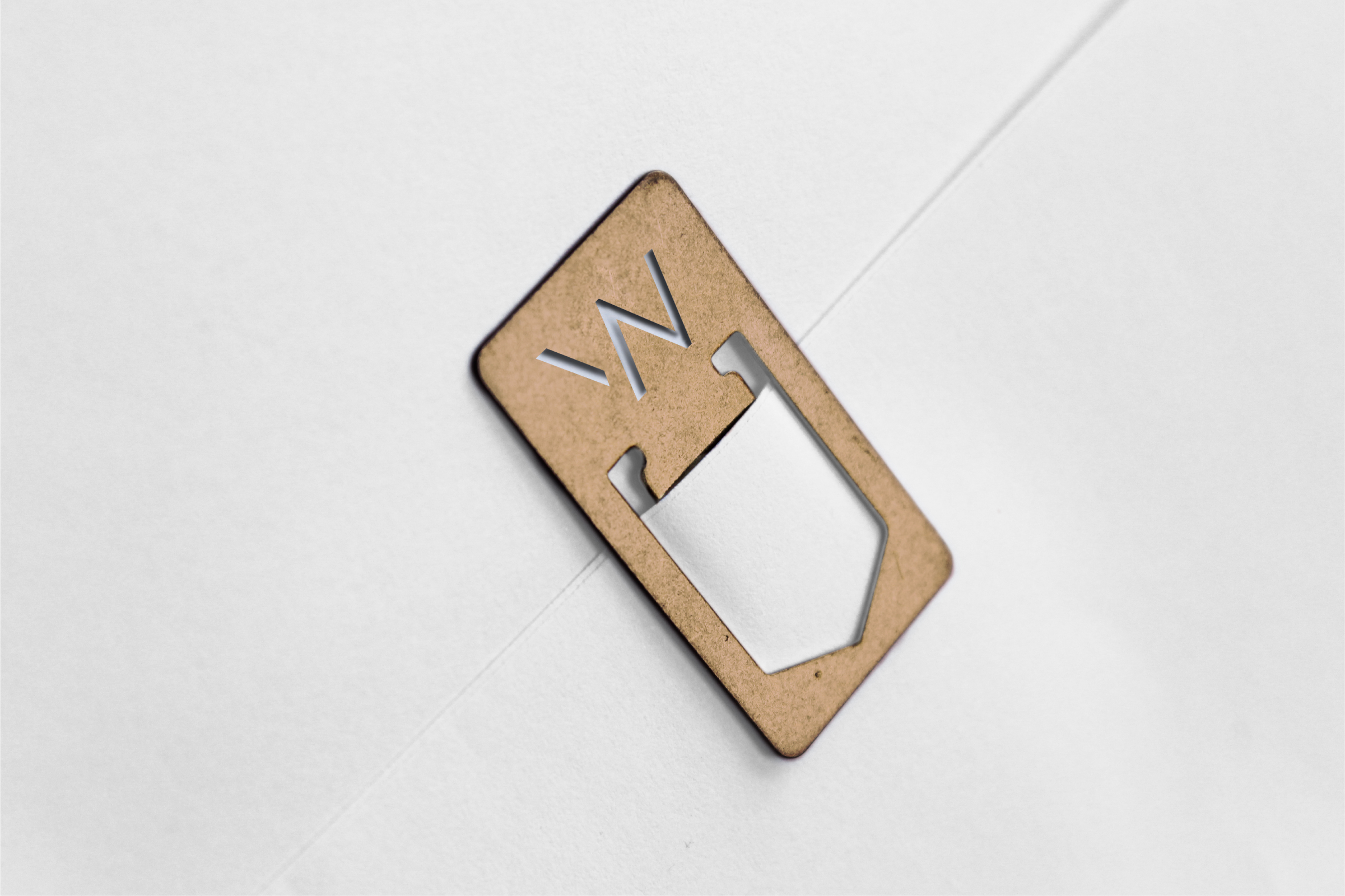



As an award-winning architectural and interior design firm, Workshop/APD believes passionately in the power of good design to shape human experience. Workshop specializes in transforming spatial experiences by bringing creativity, ingenuity and intelligence to the public and private spaces people inhabit. These experiences incorporate materials and processes that are touched, to encourage touch, as the most intimate human experience.
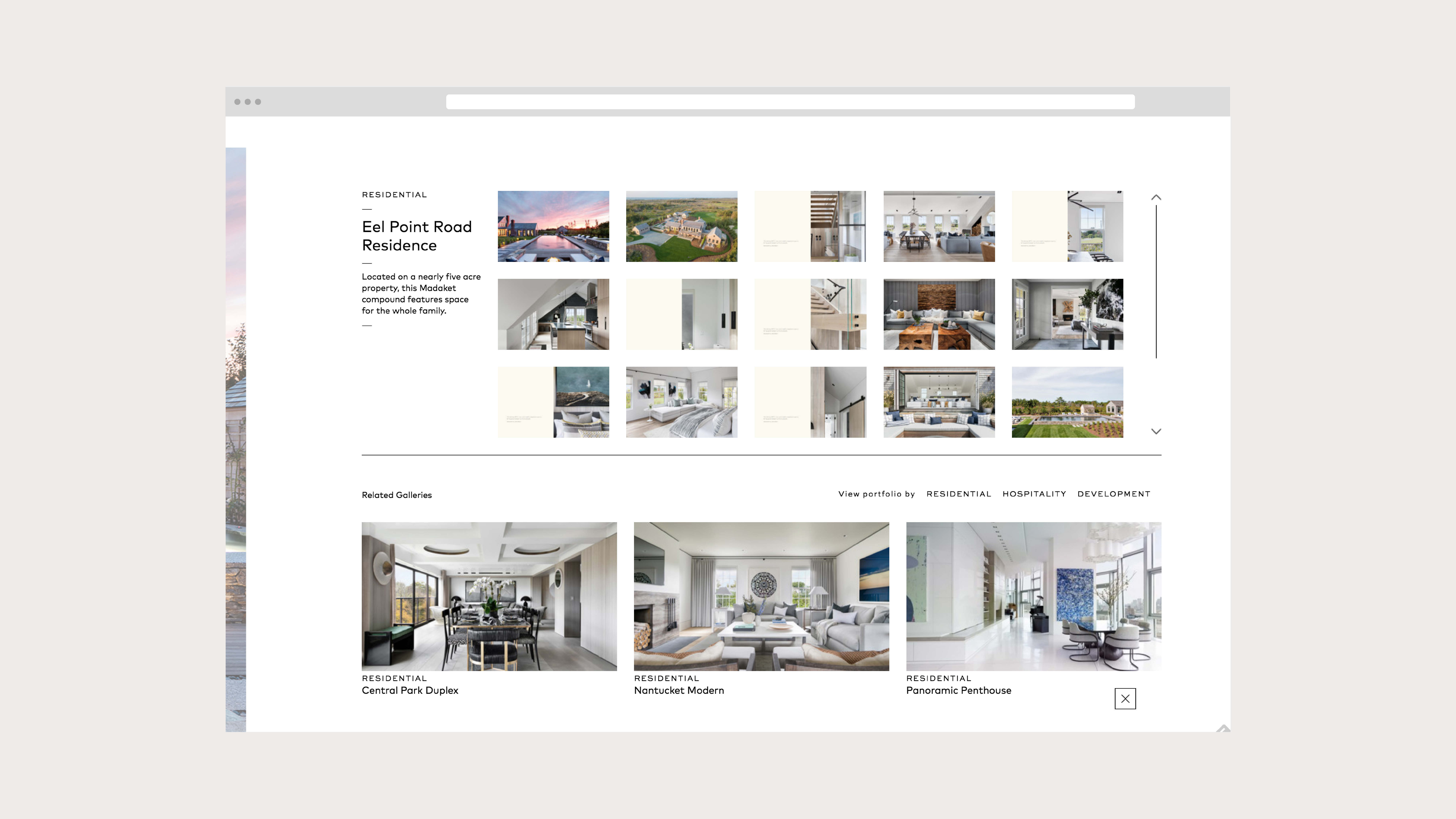
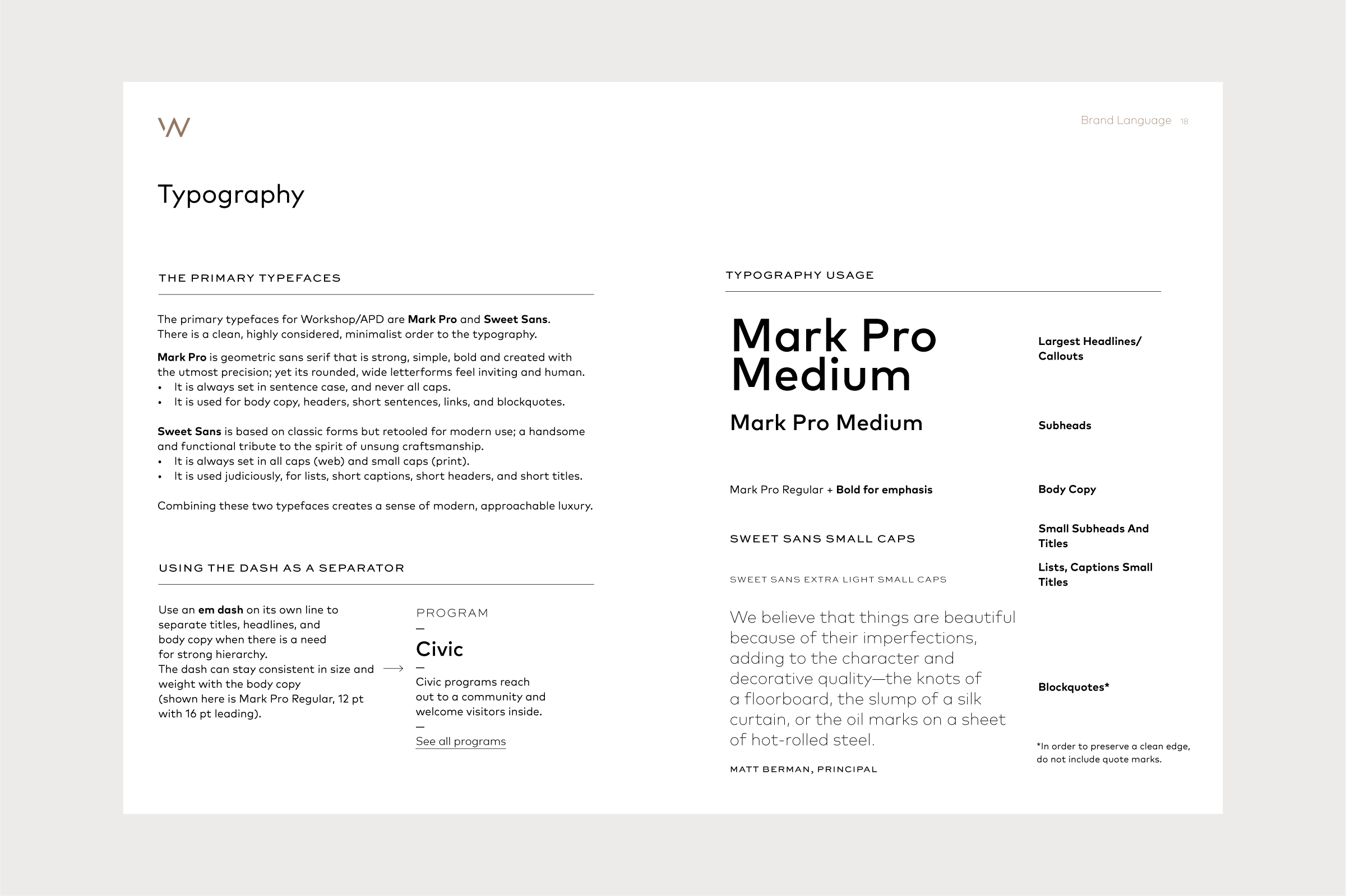
As a design lead, I worked closely with the team at Language Dept. to create and identify the brand language by developing a logo, full identity system, brand book and responsive website.
www.workshopapd.com
Communication Arts Webpick of the Day
Featured on Fonts In Use
Agency: Langugage Dept.
Role: Senior Designer
Creative Direction and Management: Jenn Cash, Language Dept.
Designer: Angela Choi
Web Development and Management: Efy Tal, Webinhabit
Featured on Fonts In Use
Agency: Langugage Dept.
Role: Senior Designer
Creative Direction and Management: Jenn Cash, Language Dept.
Designer: Angela Choi
Web Development and Management: Efy Tal, Webinhabit
A unifying visual language, born from movement

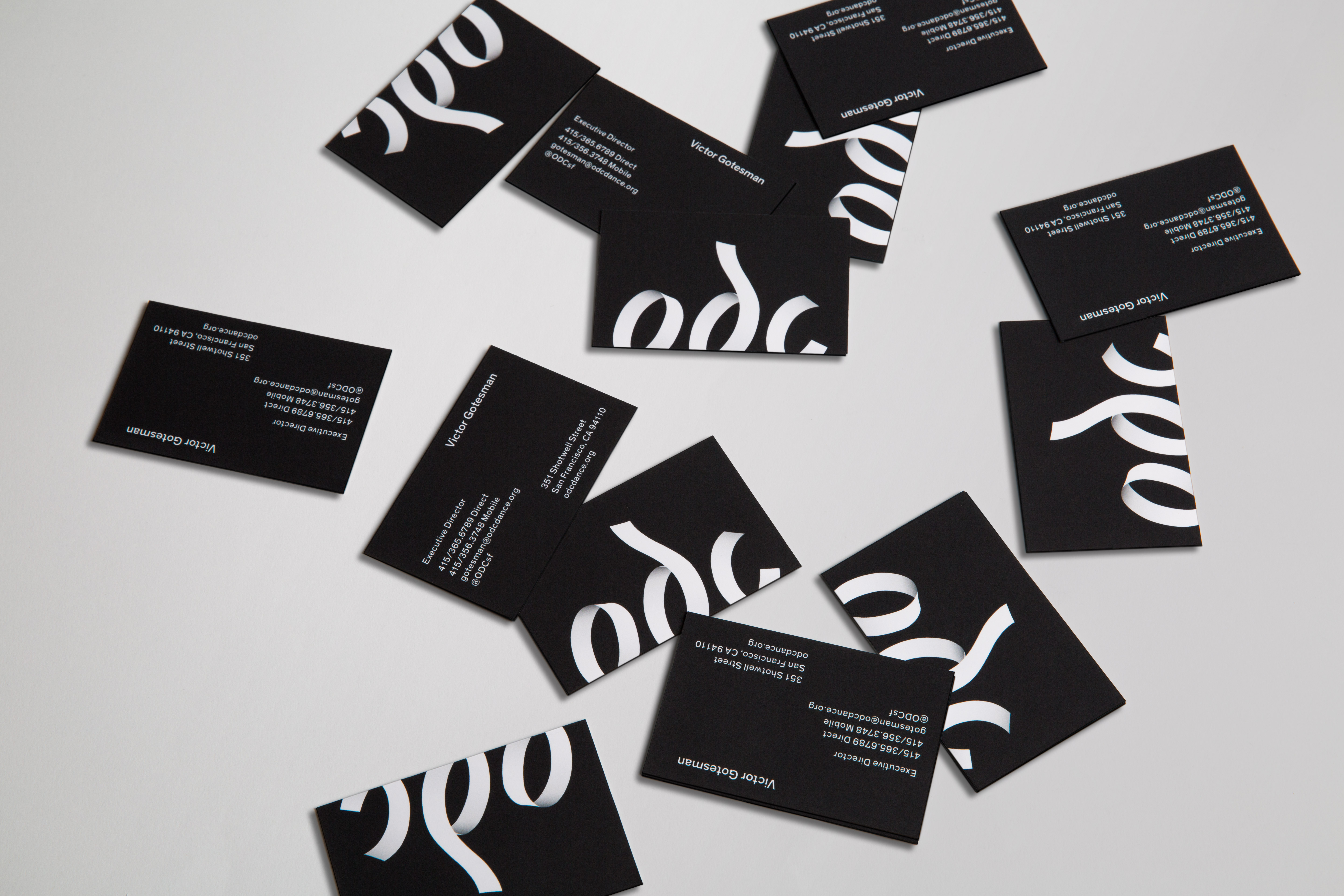

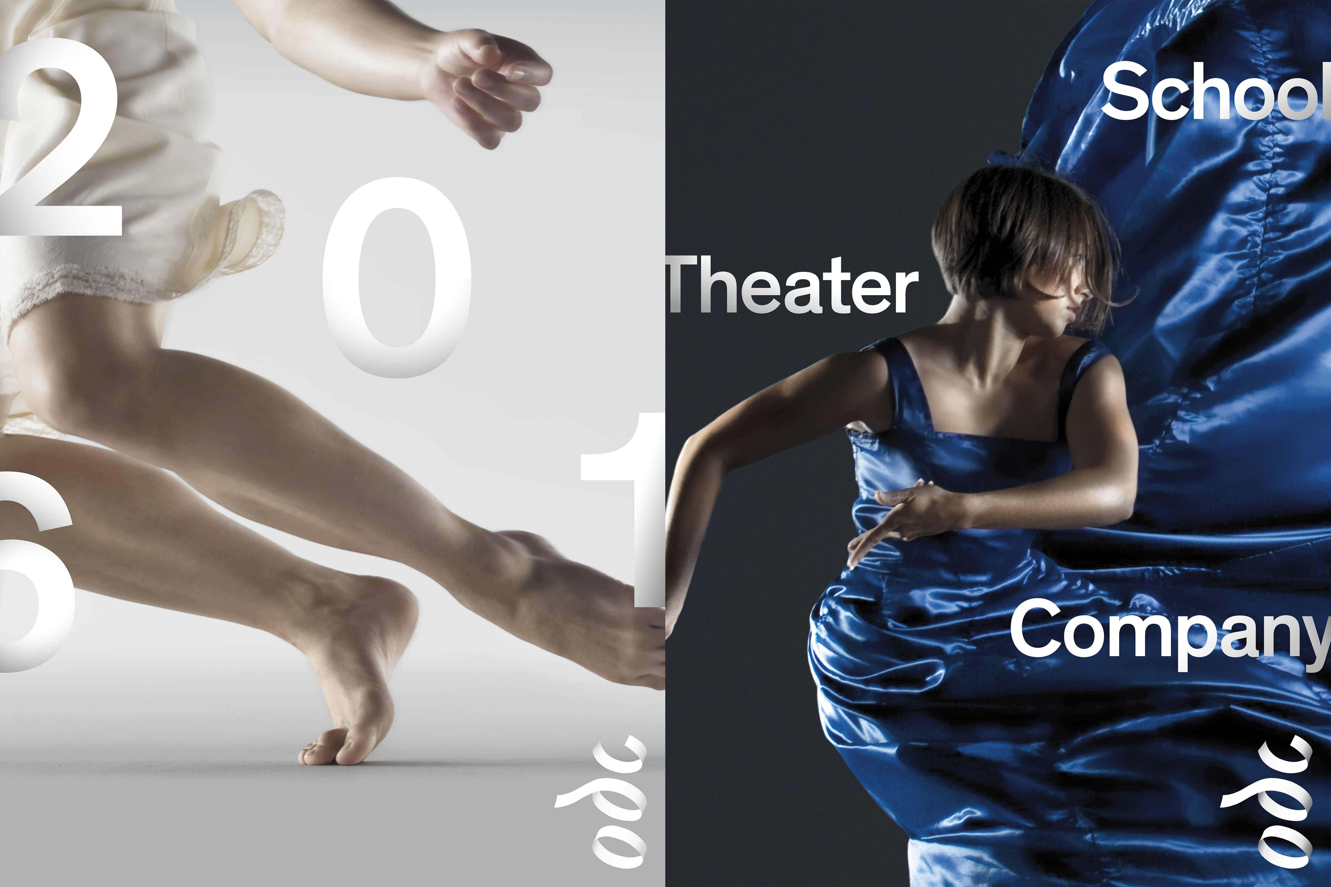
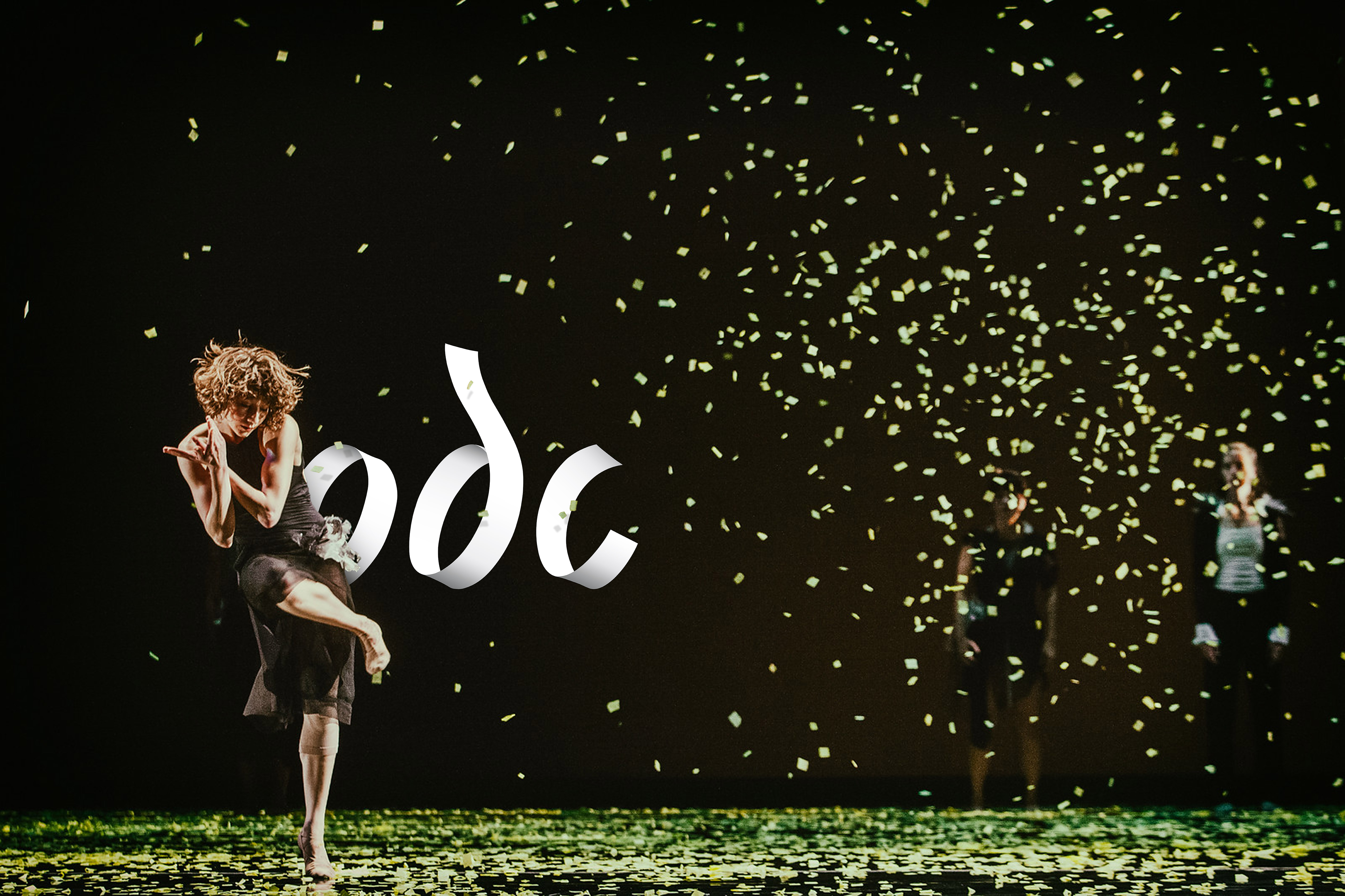
The Brief: Capture physical movement. Embrace human touch. Welcome everyone.
ODC is a contemporary dance institution rooted in San Francisco. It needed a new identity worthy of its unique voice and restless spirit. Born from the movement of paper lines and shapes moving through three-dimensional space, the identity curves and twists like a dancer. The new visual system unites three ODC organizations with radically different audiences—a professional dance company, a community-based school, and a performing arts theater—within one strong vision.
ODC is a contemporary dance institution rooted in San Francisco. It needed a new identity worthy of its unique voice and restless spirit. Born from the movement of paper lines and shapes moving through three-dimensional space, the identity curves and twists like a dancer. The new visual system unites three ODC organizations with radically different audiences—a professional dance company, a community-based school, and a performing arts theater—within one strong vision.
Roles: Logo Design, Visual Identity
Client: ODC Dance San Francisco
Studio: Landor
Creative Director: Carolyn Ashburn
Executive Creative Director: Mark Frankel
Motion Graphics: Britt Anderson
Awards: Graphis Gold, Print & Branding; Graphis Silver, Logo Design
Client: ODC Dance San Francisco
Studio: Landor
Creative Director: Carolyn Ashburn
Executive Creative Director: Mark Frankel
Motion Graphics: Britt Anderson
Awards: Graphis Gold, Print & Branding; Graphis Silver, Logo Design

Accenture Rebrand
Agency: Landor
Due to the sensitive nature of this content, it cannot be shared publicly. Please email me to request access to this project.
Agency: Landor
Due to the sensitive nature of this content, it cannot be shared publicly. Please email me to request access to this project.
Breathing new life into a historical arts venue

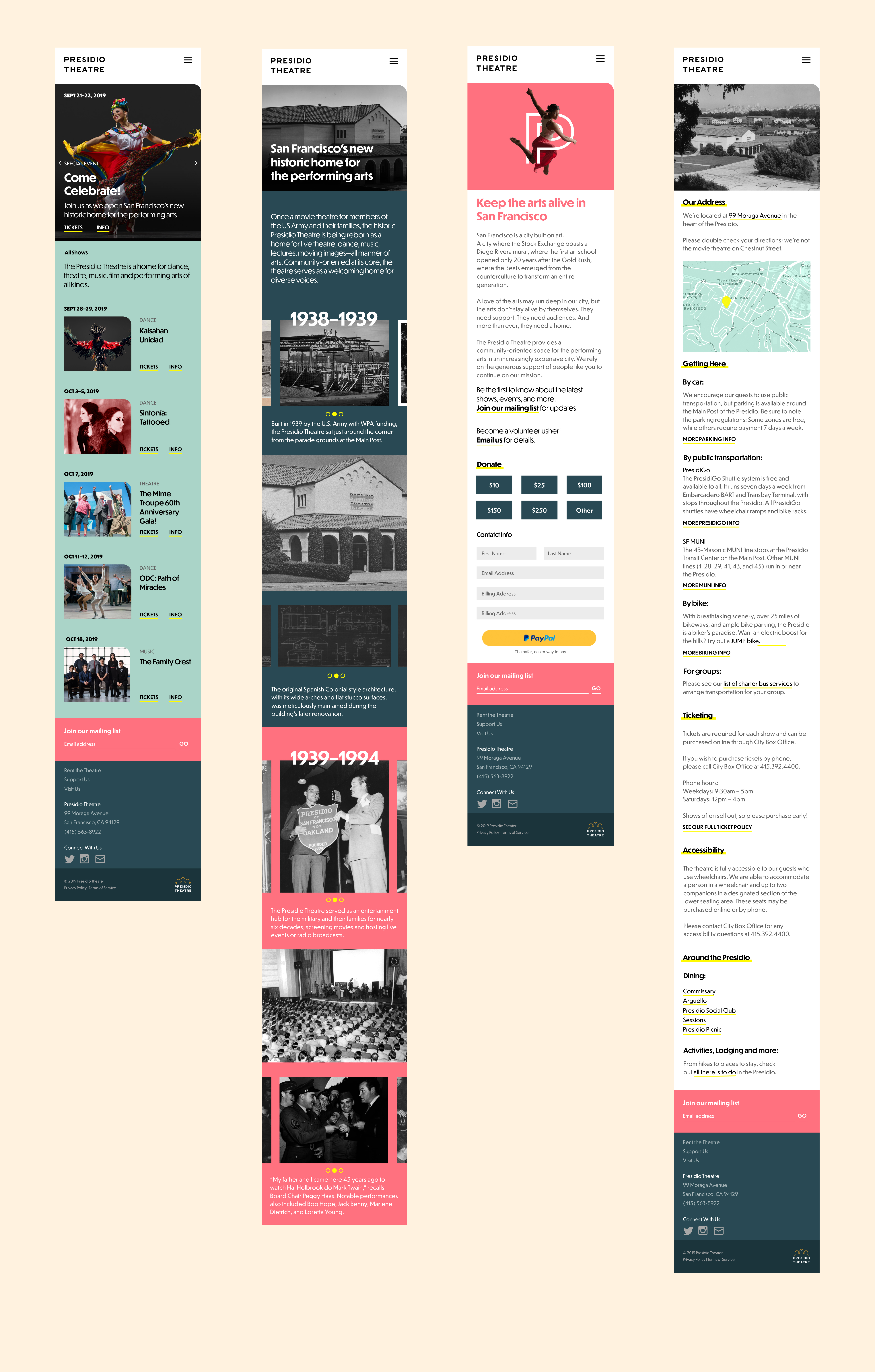
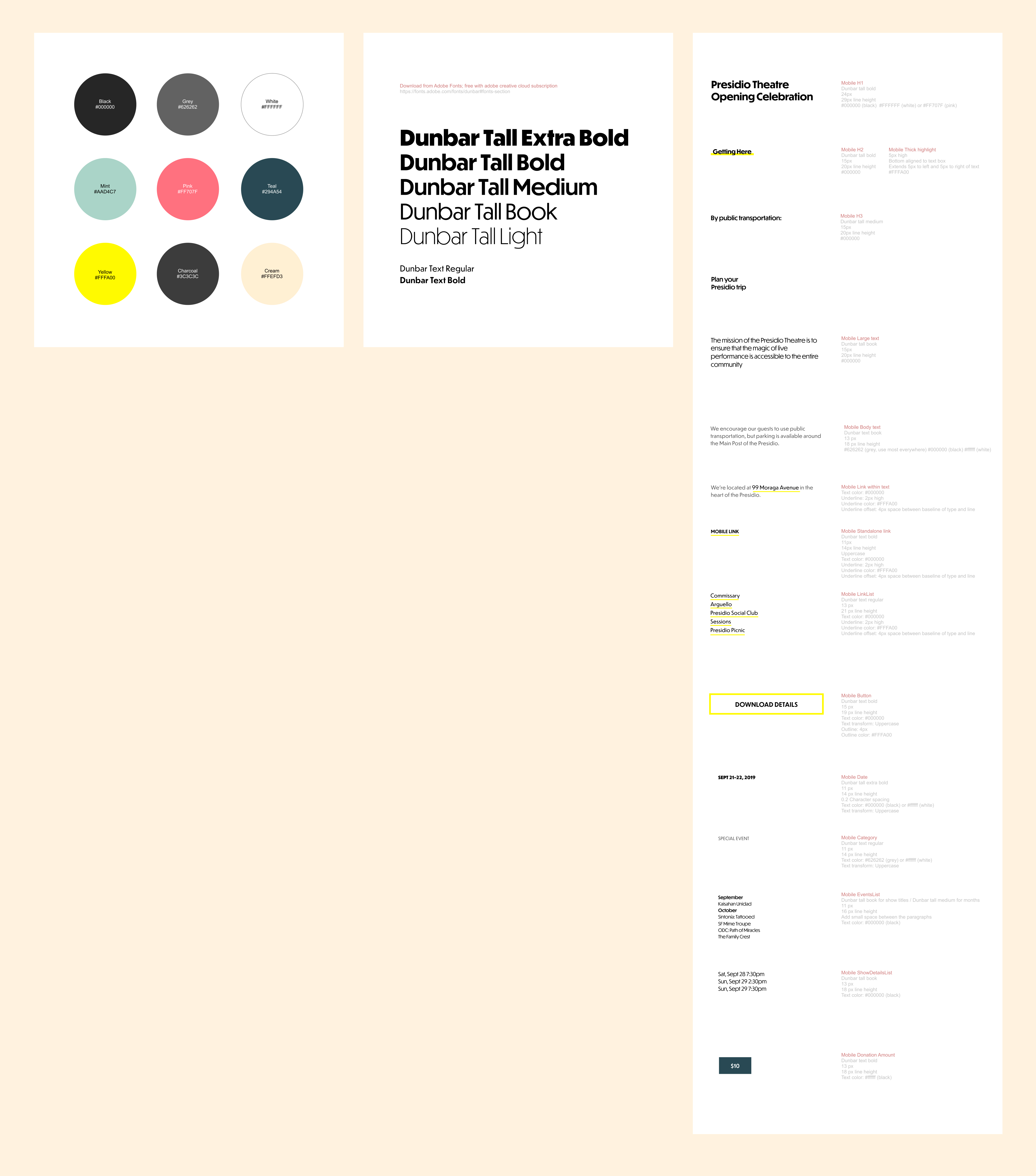
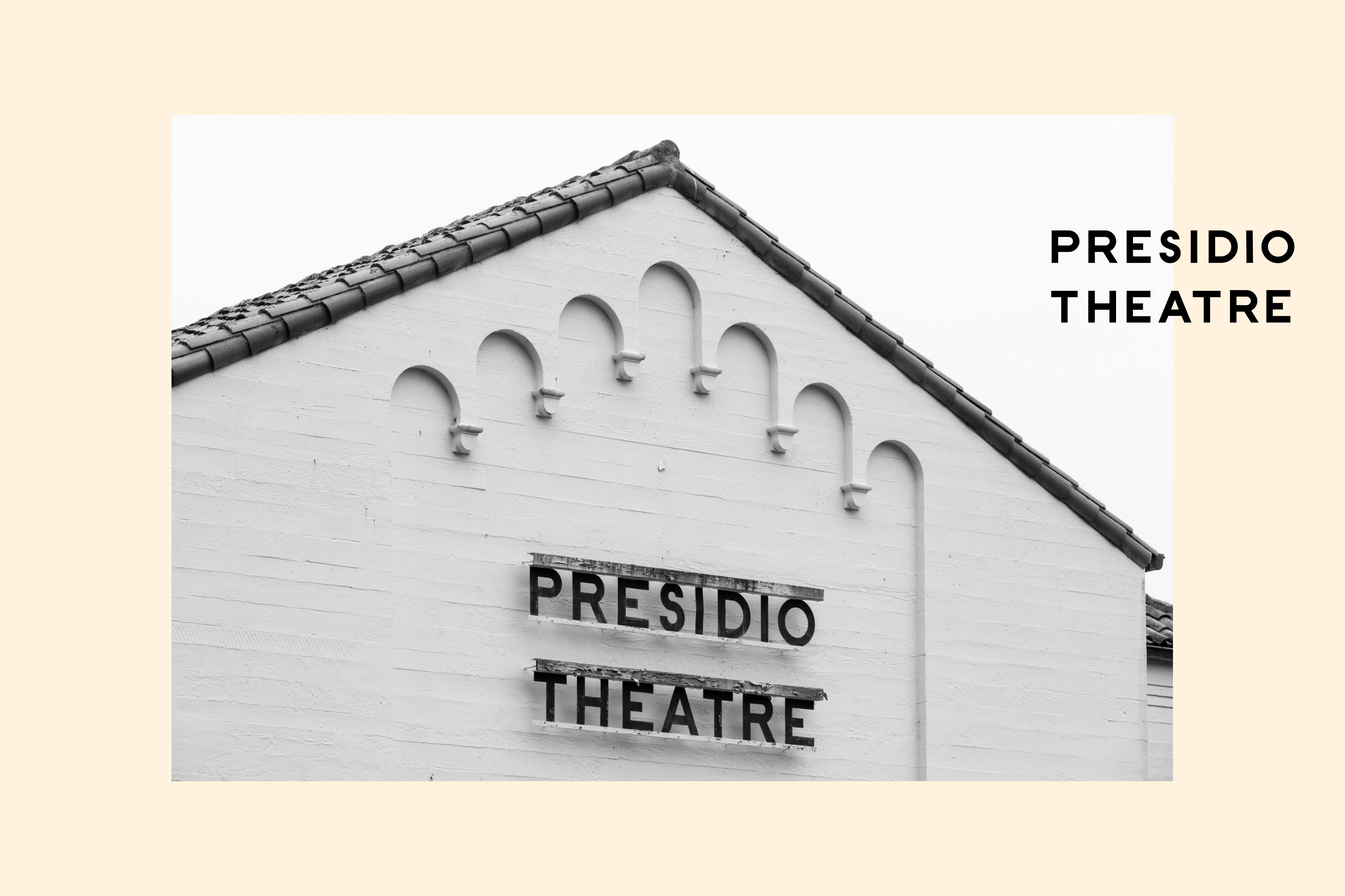
Built in 1939 and originally used as an entertainment venue for military soldiers, the Presidio Theatre came back to life in the fall of 2019 — after many years of disrepair and neglect. The theatre’s art deco-era bones were lovingly restored, opening to great fanfare and giving new life to an old space. The new mobile-first site tells the story of the space while inviting in a new generation of patrons to it’s dance, music, and theatre performances.
The main typeface, Dunbar, is itself a reinterpretation of the 20’s era Erbar-Grotesk. I recreated the theatre’s original signage for the site header.
Studio: I.D.W
Creative Director: Elina Frumerman
Art Director/Senior Graphic Designer: Leah Koransky
ECD: Leigh Okies
Writer: Cathy Bishop
PMs: Anna Acquistapace, Jaleen Francois
The main typeface, Dunbar, is itself a reinterpretation of the 20’s era Erbar-Grotesk. I recreated the theatre’s original signage for the site header.
Studio: I.D.W
Creative Director: Elina Frumerman
Art Director/Senior Graphic Designer: Leah Koransky
ECD: Leigh Okies
Writer: Cathy Bishop
PMs: Anna Acquistapace, Jaleen Francois
Designing a zine for waterpeople
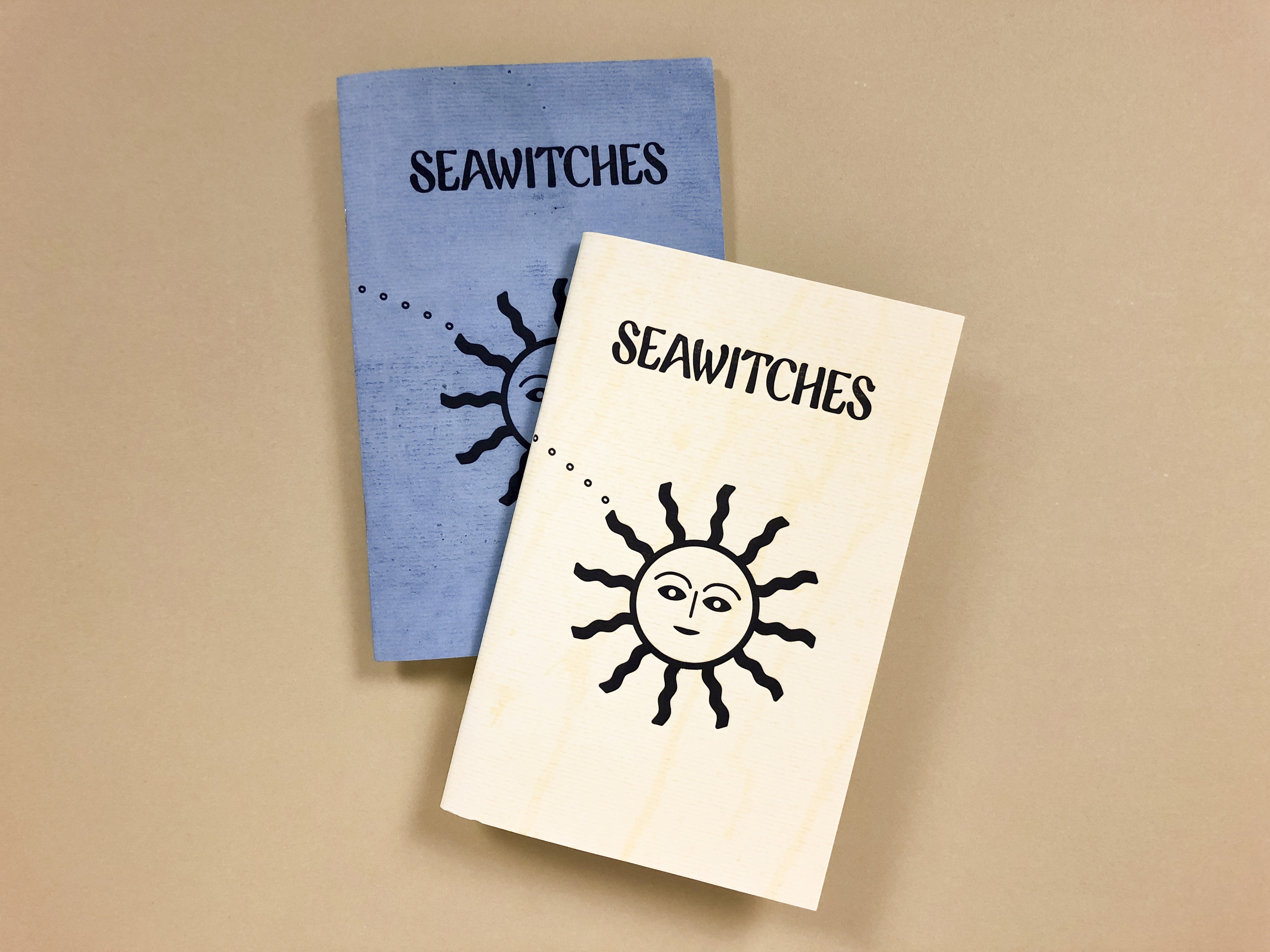
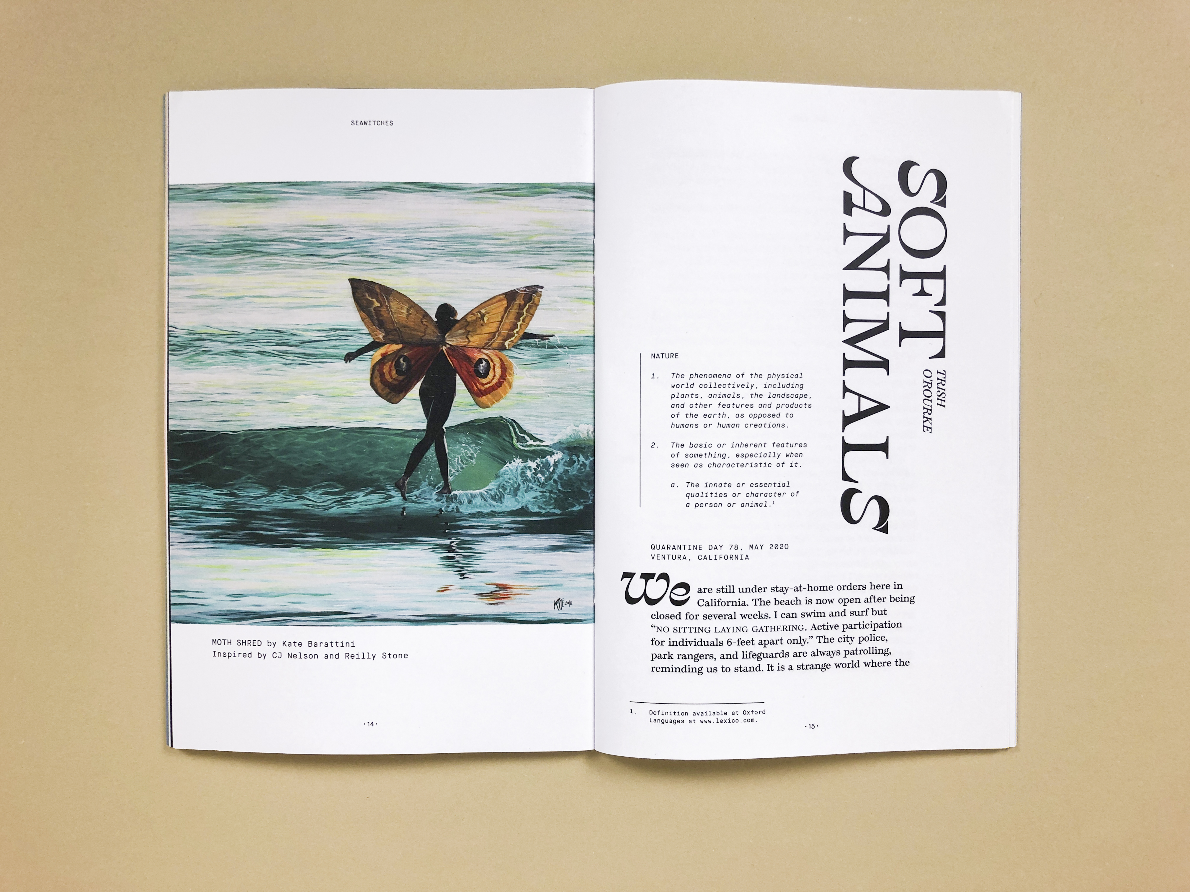

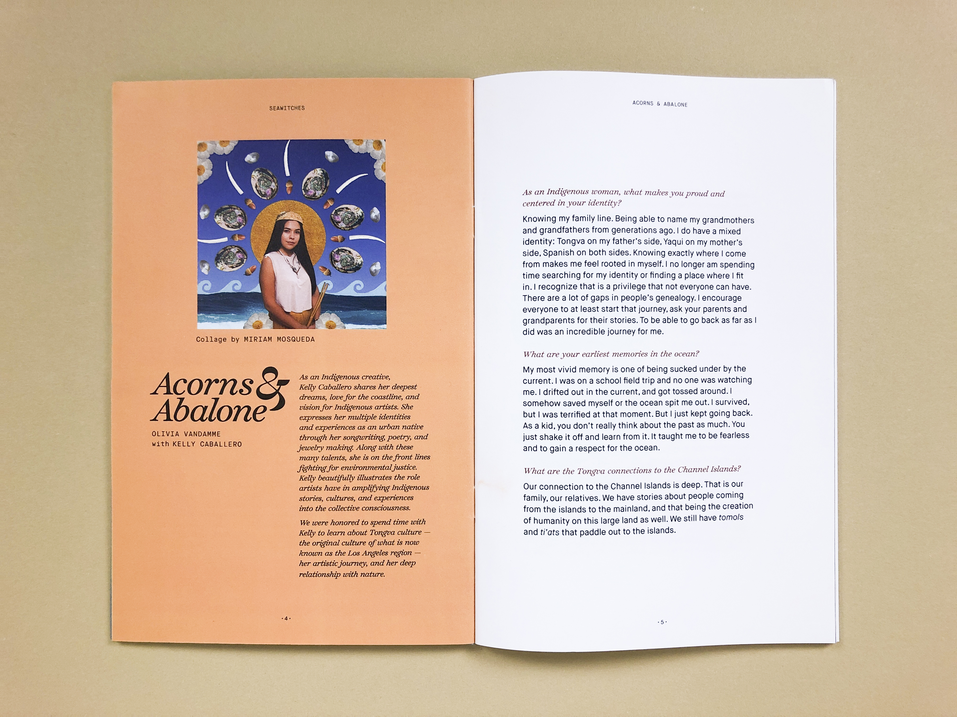
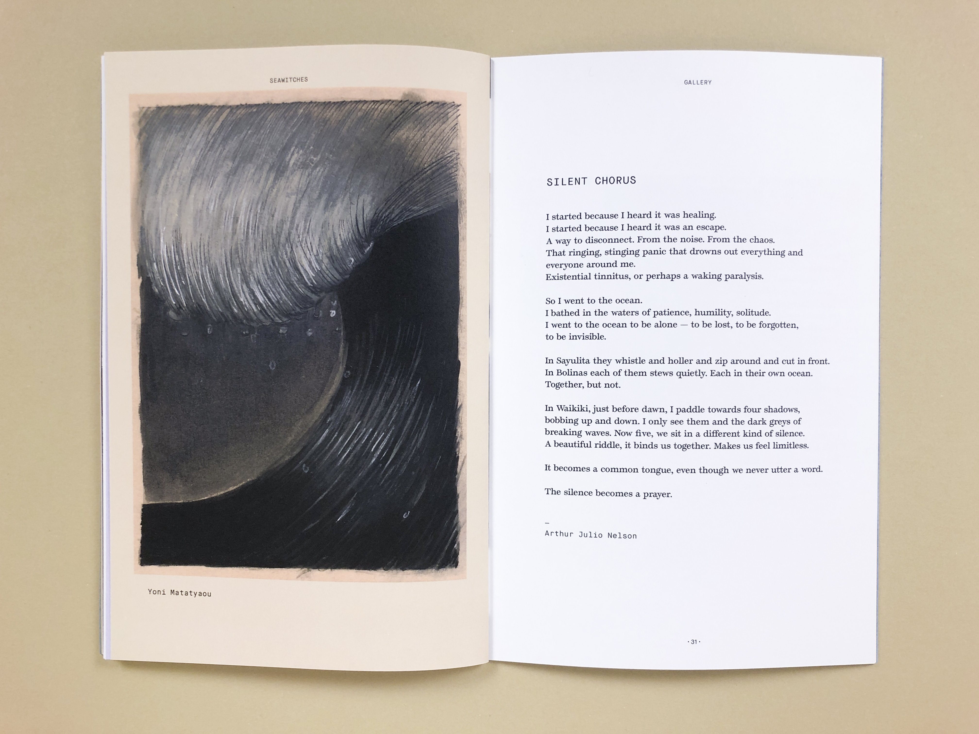
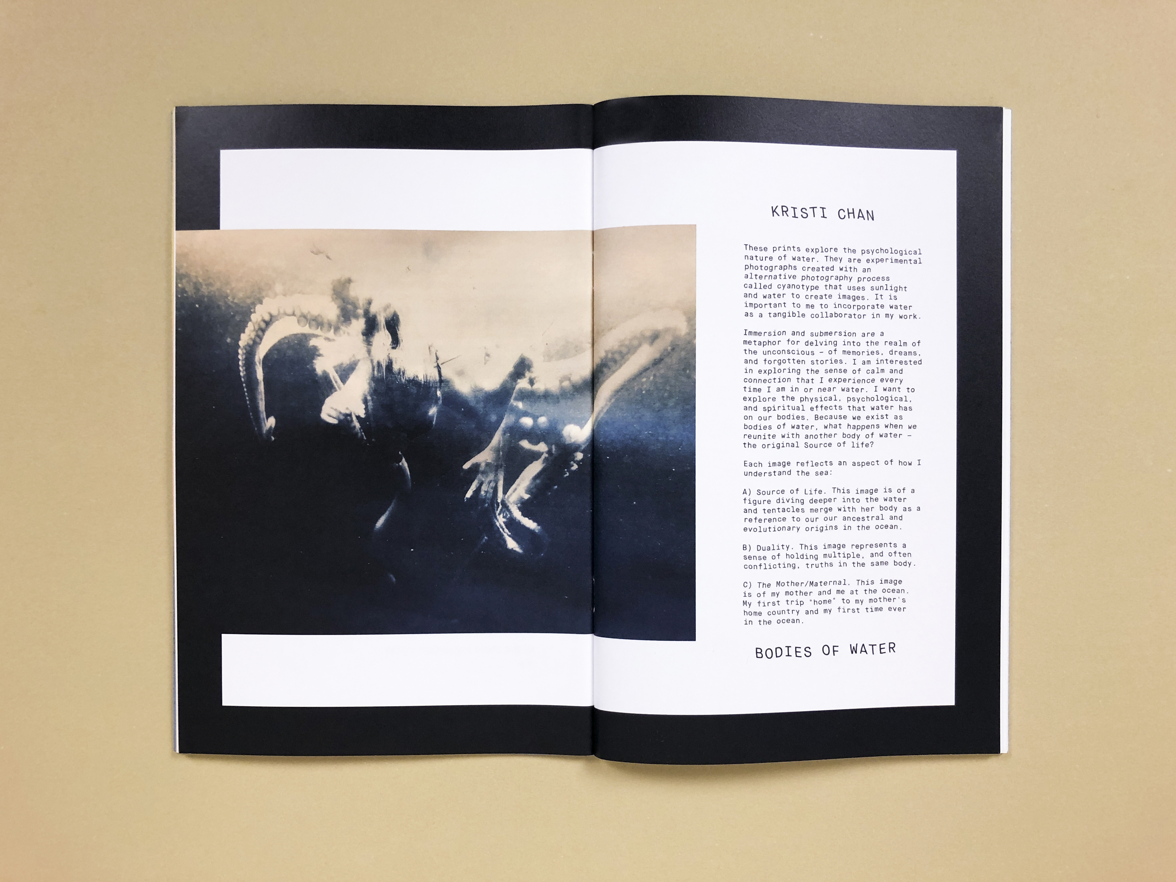

Seawitches, a zine for waterpeople, is a bi-annual print publication and platform for community building. Founded by surfer Margaret Seelie in 2015, the project exists to tell stories inspired by water.
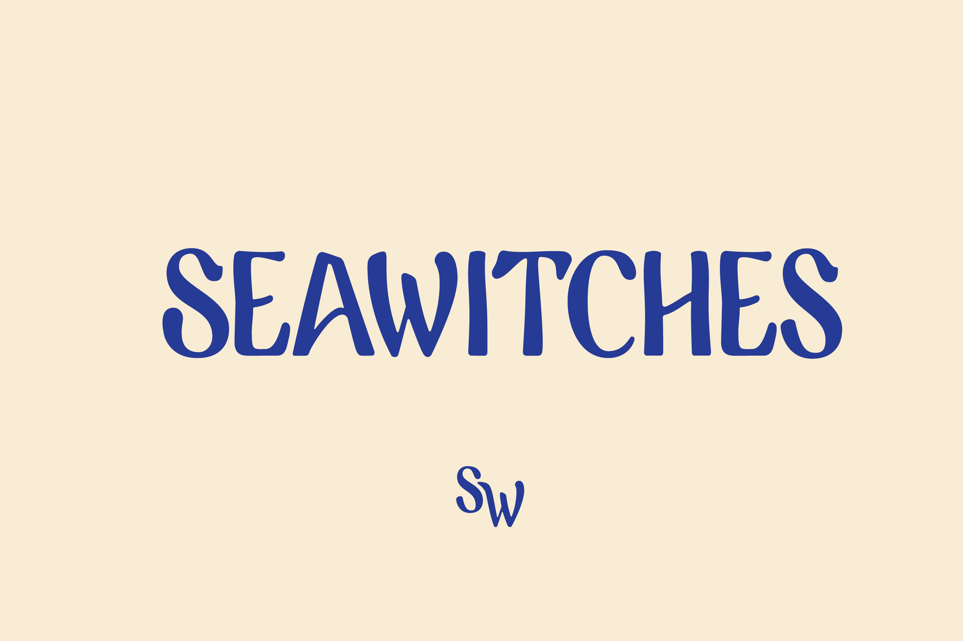
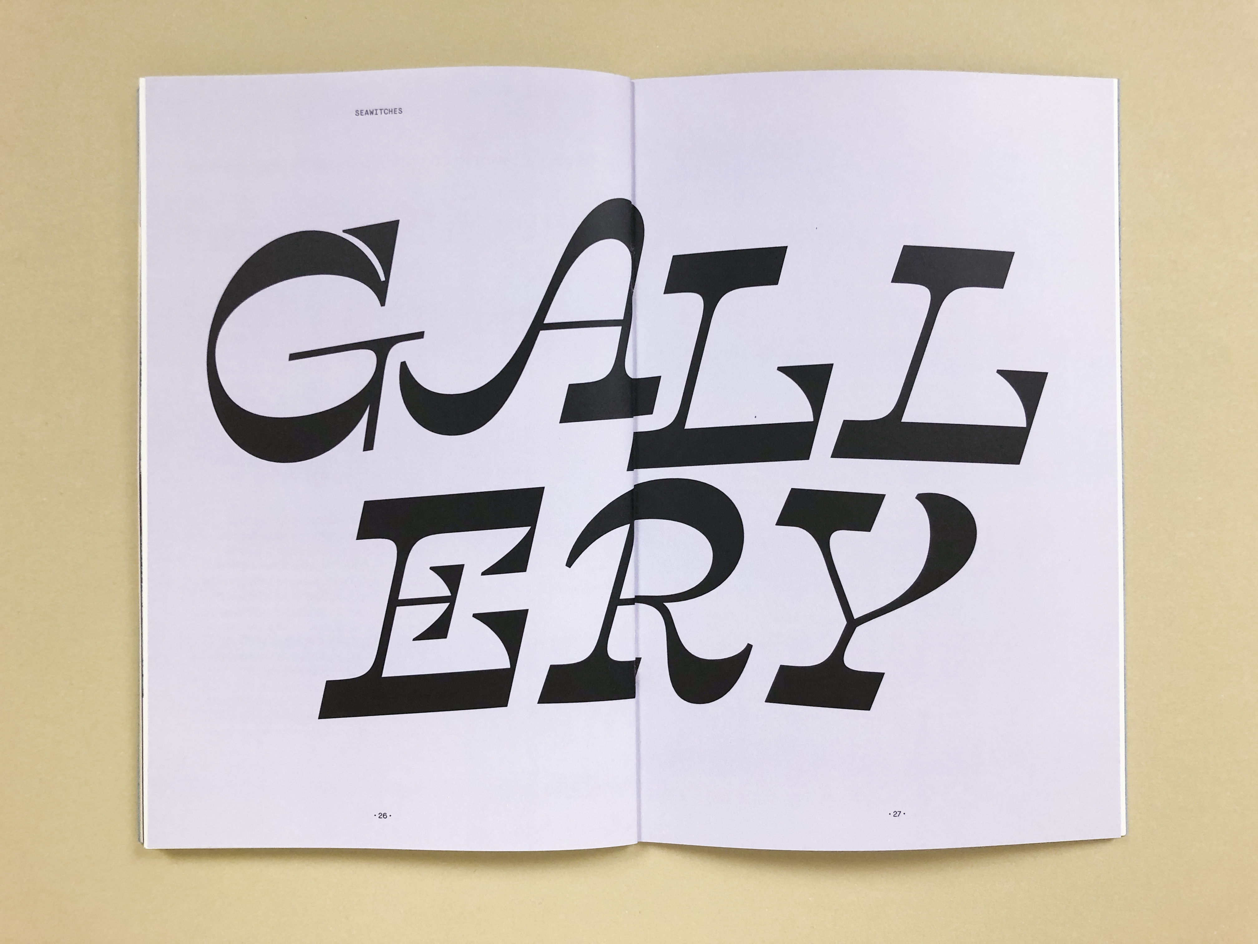
As a community-based platform, each issue takes on the life of its contributors. I used the typeface Temeraire for narrative personal stories and Temeraire Italienne for display headlines throughout the zine. Additional copy is set in Maison Neue, Maison Neue Mono, and Recoleta. Designer Savannah Rusher created the custom Wetsuit Guide title treatment and illustrations.
I drew the Seawitches logo by hand; it references California surf culture, vintage paperback sci-fi and mystery novels, and psychedelia.
Reflecting the DIY spirit of the zine the covers are hand-dyed with botanical inks: the blue is indigo and the yellow is fennel and oxalis flowers.
See the fontsinuse.com feature ︎︎︎
Printed and bound by Colorprint in Burlingame, CA.
Covers letterpress printed at Open Windows Cooperative in San Franicsco, CA
Cover art by Cristine Blanco.
As a community-based platform, each issue takes on the life of its contributors. I used the typeface Temeraire for narrative personal stories and Temeraire Italienne for display headlines throughout the zine. Additional copy is set in Maison Neue, Maison Neue Mono, and Recoleta. Designer Savannah Rusher created the custom Wetsuit Guide title treatment and illustrations.
I drew the Seawitches logo by hand; it references California surf culture, vintage paperback sci-fi and mystery novels, and psychedelia.
Reflecting the DIY spirit of the zine the covers are hand-dyed with botanical inks: the blue is indigo and the yellow is fennel and oxalis flowers.
See the fontsinuse.com feature ︎︎︎
Printed and bound by Colorprint in Burlingame, CA.
Covers letterpress printed at Open Windows Cooperative in San Franicsco, CA
Cover art by Cristine Blanco.