Cross-platform information design for an established non-profit


The
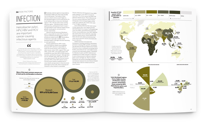
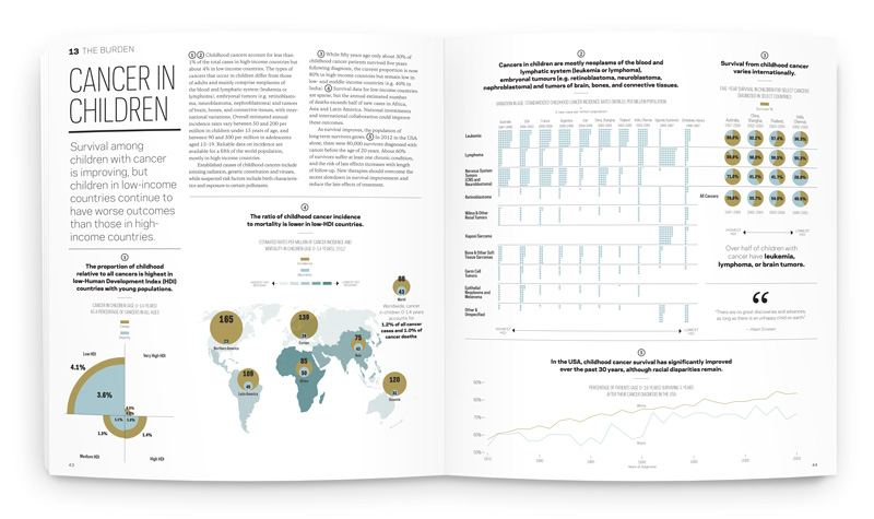
American Cancer Society's Cancer Atlas is a 136-page book comprised of nearly 100 insets and 44 choropleth-coded maps illustrating global data. The visual voice was inspired by academic quarterly publications; sophisticated but digestible, with a color palette inspired by tissue and cell photography. Circles are used as a consistent throughline, to represent the cellular and global levels that cancer strikes.
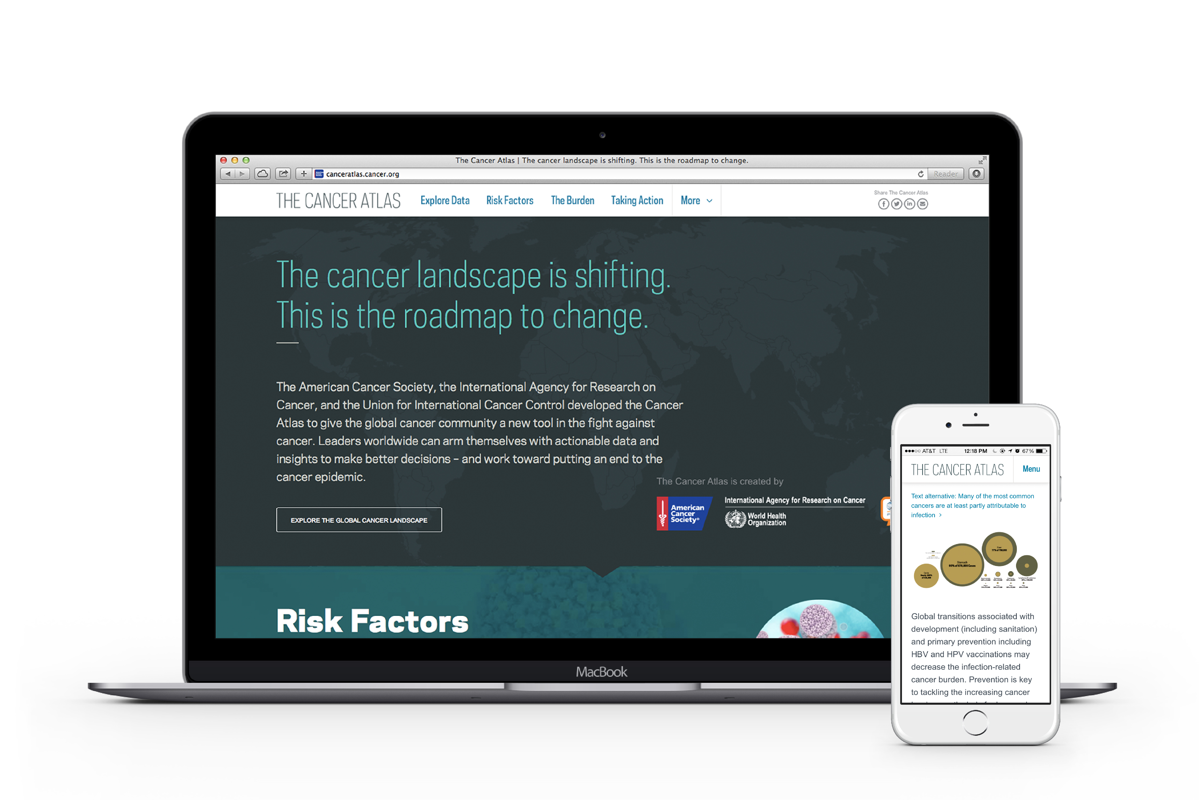
Companion interactive site by Atlantic Media.
Companion interactive site by Atlantic Media.
Agency: Language Dept.
Role: Design, Mapping, Data Visualization, Art Direction
Additional Creative Direction, Design, Mapping and Data Visualization: Jenn Cash, Tanya Quick, Lizania Cruz, Angela Choi
Production: Johnny Hsu
Honors: Featured case study on the AIGA blog in "Design for Good" Staff Pick; Fonts in Use by Font Bureau; Companion site a 2015 Webby Award nominee