Recently.


The Shape of Creativity
Magazine for 2026 Adobe 99U Conference
Roles: Art Direction, Design, and Production
Client: Adobe
Editor: Laura Feinstein
Design Director: Sonja Hernandez
Cover Illustration: Aaron Lowell Denton
Printing: Colorprint
Bindery and Foil Stamping: On-Line Bindery
The Shape of Creativity
Magazine for 2026 Adobe 99U Conference
Roles: Art Direction, Design, and Production
Client: Adobe
Editor: Laura Feinstein
Design Director: Sonja Hernandez
Cover Illustration: Aaron Lowell Denton
Printing: Colorprint
Bindery and Foil Stamping: On-Line Bindery
An experimental design activation
As collaborator and promoter of creativity, I designed and implemented a large scale installation with the Landor team for SF Design Week.
 Logotype by Jake Kincaid


Agency: Landor
Logotype: Jake Kincaid
Collaborators: Landor SF Design Team
Poster Design: Thomas Hutchings
Logotype: Jake Kincaid
Collaborators: Landor SF Design Team
Poster Design: Thomas Hutchings
Capturing the pillars of hosting with Airbnb Plus
Airbnb Plus is a selection of homes verified for hospitality, ame nities, and design. As the senior designer on the team, I worked with photo editors, art directors, marketing managers, and product teams to ensure all work continually reflected a sense of craft, high quality, and brand cohesion.
I continually pushed teams to think about how the Plus brand can come to life in creative ways while maintaining a consistent presence. Applications range from video title treatments, host communication materials, branded merchandise, advertising, internal decks, host education strategy, and more.
Film title treatments


Advertising & marketing


Visualizing paradise for the holidays at Airbnb
The goal of this campaign for Airbnb Germany/UK was to create a guide for guests to get excited about planning a magical holiday.
The color palette and visuals were designed to bring forth a tone that is happy, warm, inspired and magical.
Components of the campaign—designed in-house at Airbnb—include paid and organic social media, email, landing pages, and merchandising pages in the app and on the web.
I designed and did final production and release of all of the components and helped to oversee illustration and animation, working closely with art directors and writers to form a cohesive system.
Instagram Story

Instagram
Carousel
Carousel


Email

Landing Page

Senior Art Director / Designer: Myray Reames
Illustration Art Director: Naomi Benson
Designer: Leah Koransky
Copywriter: Daniel Paredes
Creative Director: Naz Arandi
Illustrator: Benjamin Fluow
A crafted visual identity for a modern design firm
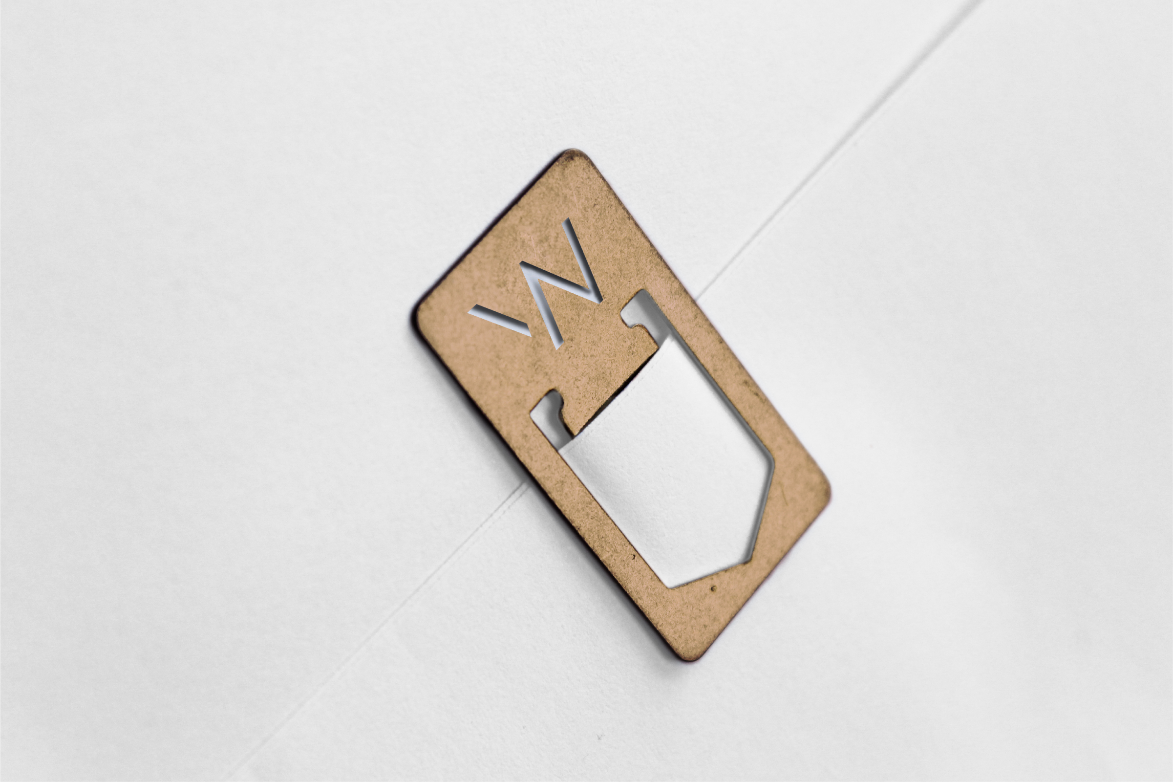


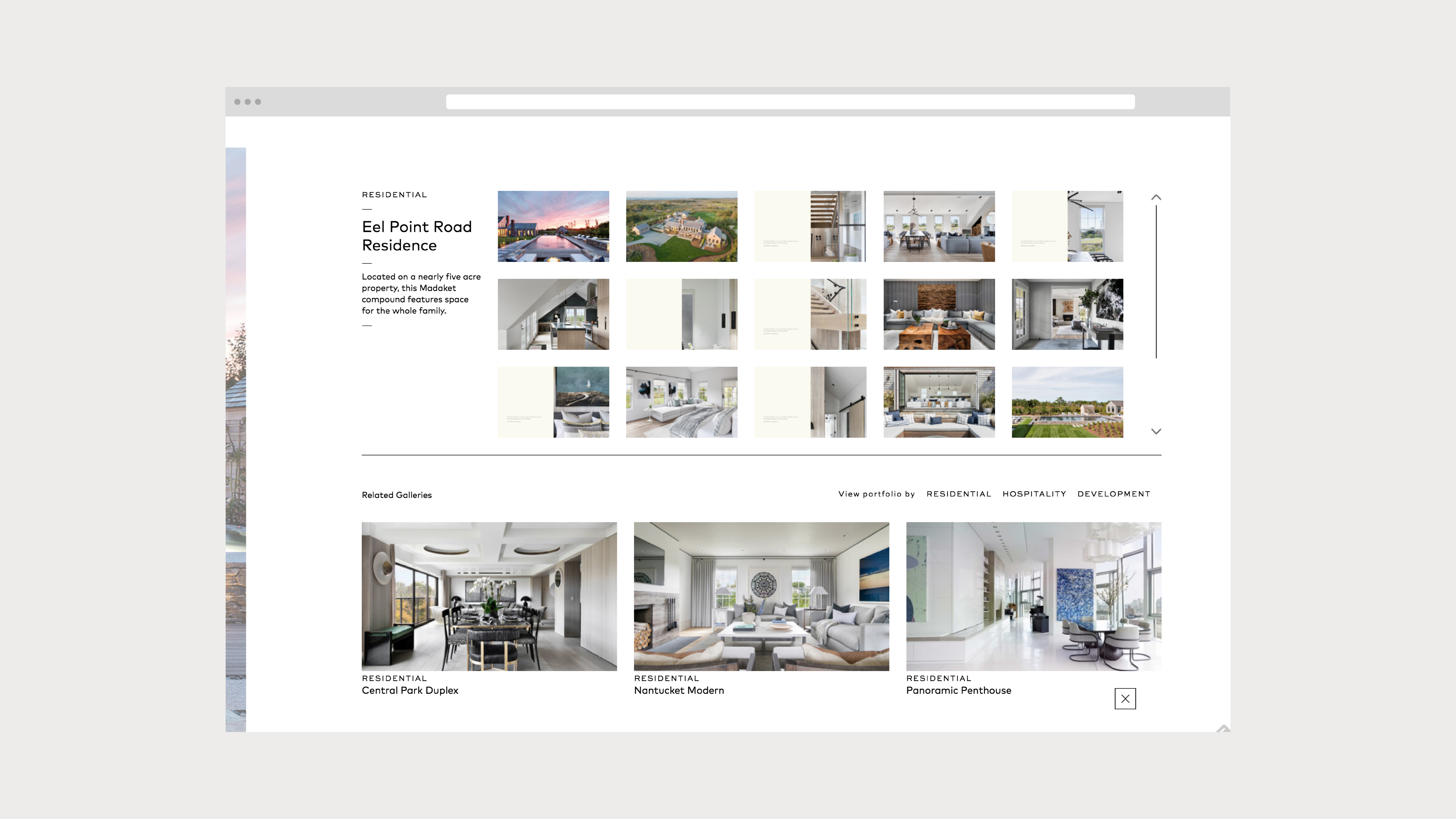
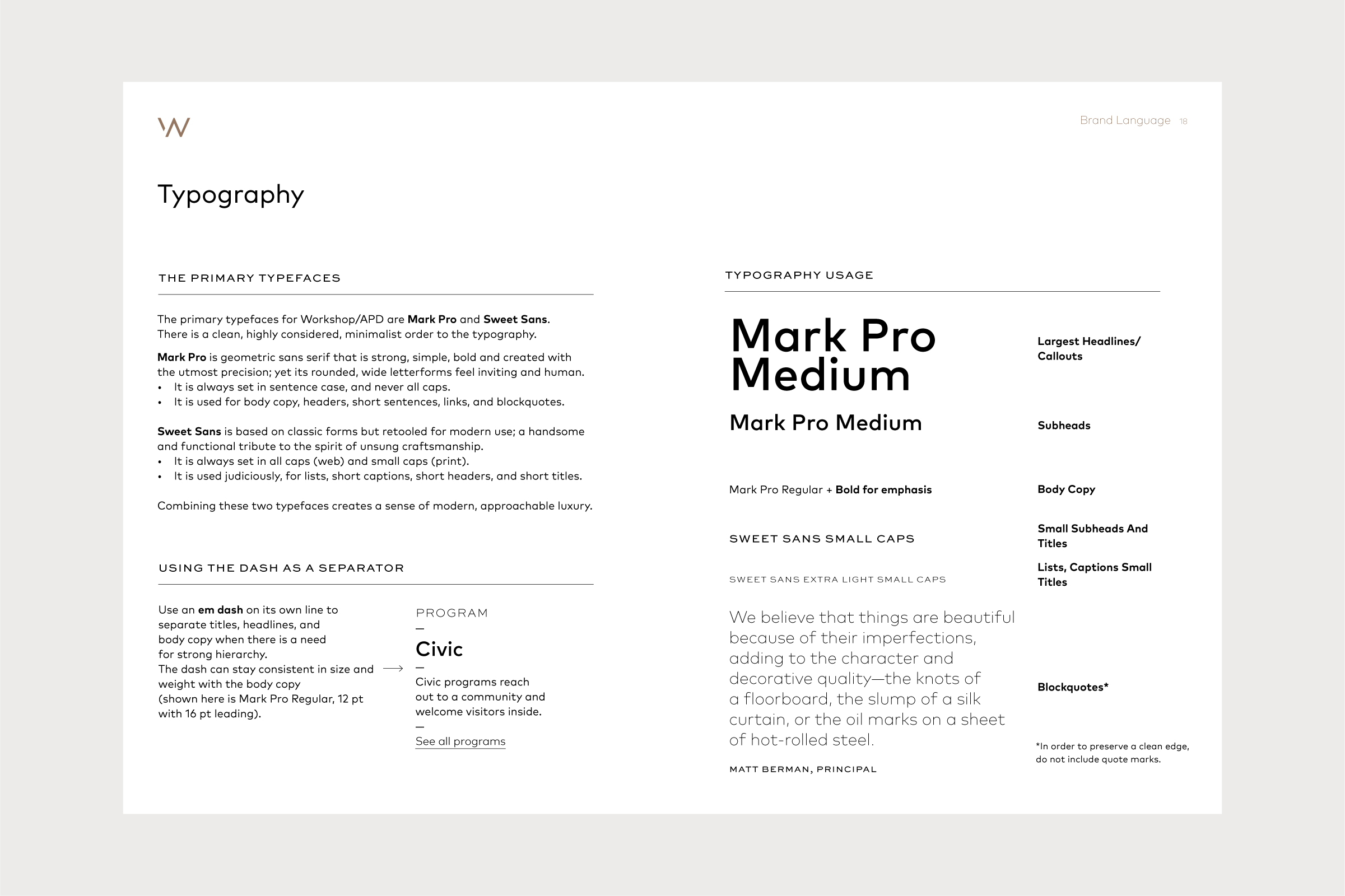

As an award-winning architectural and interior design firm, Workshop/APD believes passionately in the power of good design to shape human experience. Workshop specializes in transforming spatial experiences by bringing creativity, ingenuity and intelligence to the public and private spaces people inhabit. These experiences incorporate materials and processes that are touched, to encourage touch, as the most intimate human experience.
As a design lead, I worked closely with the team at Language Dept. to create and identify the brand language by developing a logo, full identity system, brand book and responsive website.
www.workshopapd.com
Communication Arts Webpick of the Day
Featured on Fonts In Use
Agency: Langugage Dept.
Role: Senior Designer
Creative Direction and Management: Jenn Cash, Language Dept.
Designer: Angela Choi
Web Development and Management: Efy Tal, Webinhabit
Featured on Fonts In Use
Agency: Langugage Dept.
Role: Senior Designer
Creative Direction and Management: Jenn Cash, Language Dept.
Designer: Angela Choi
Web Development and Management: Efy Tal, Webinhabit
A unifying visual language, born from movement

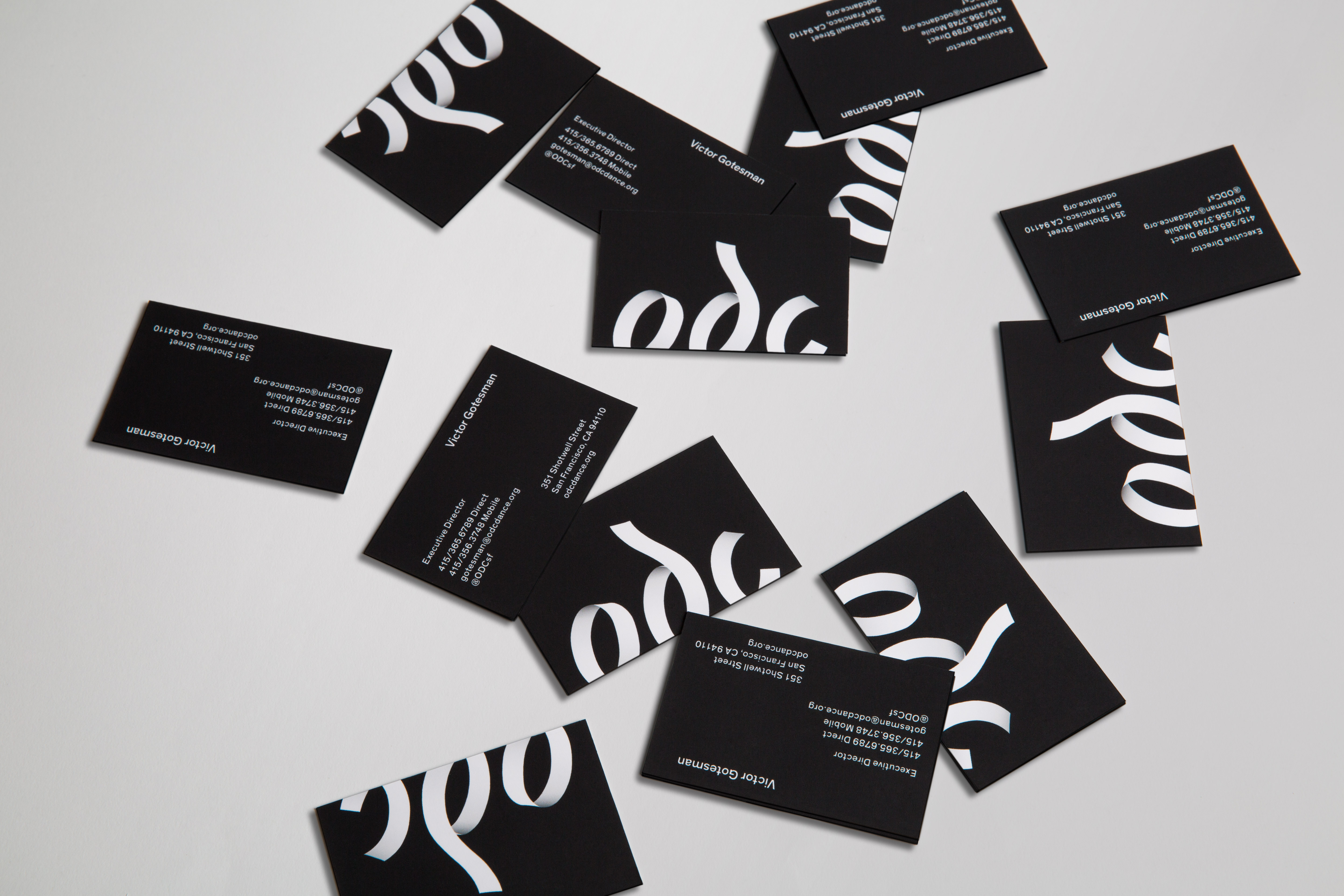

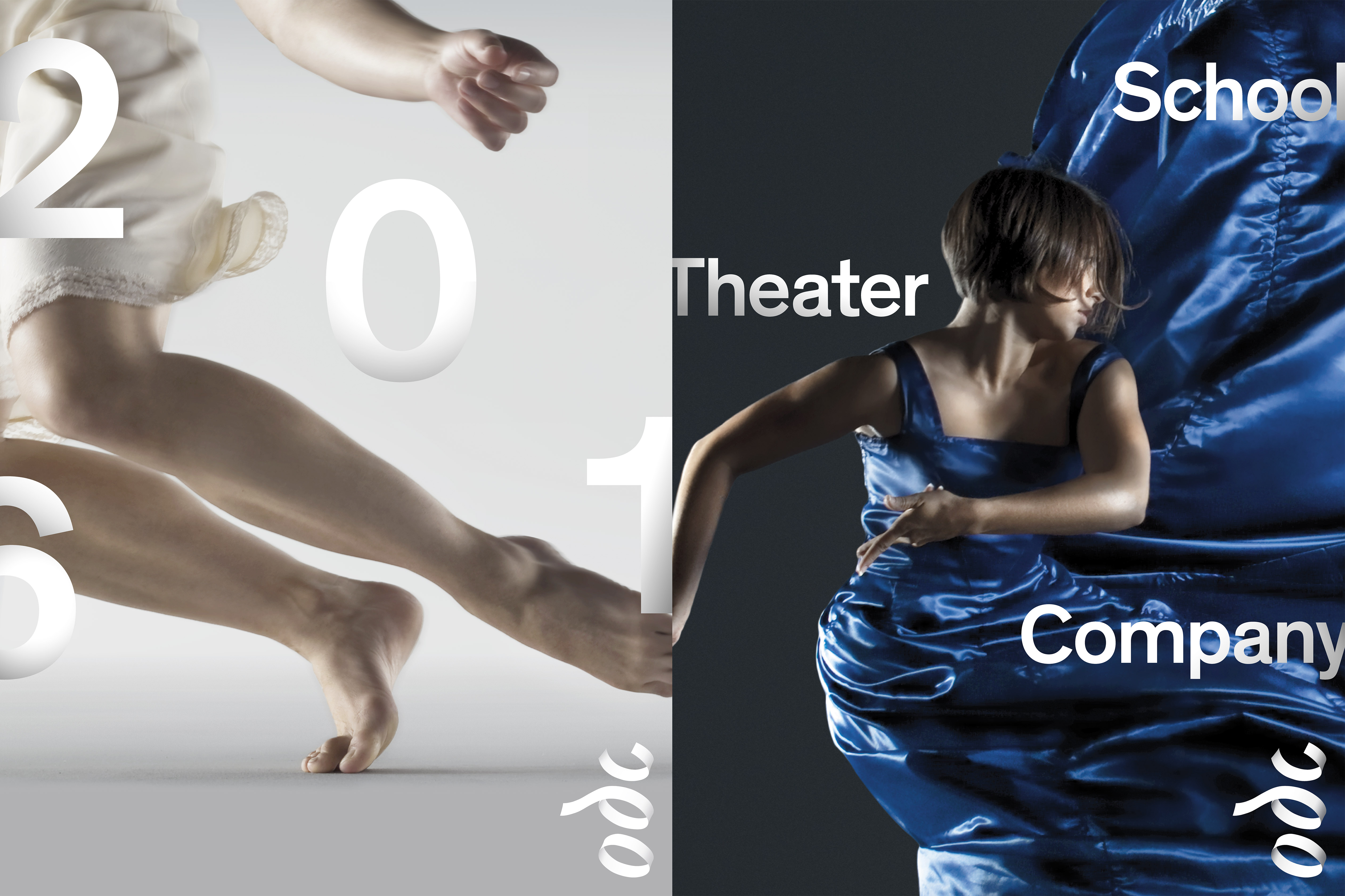
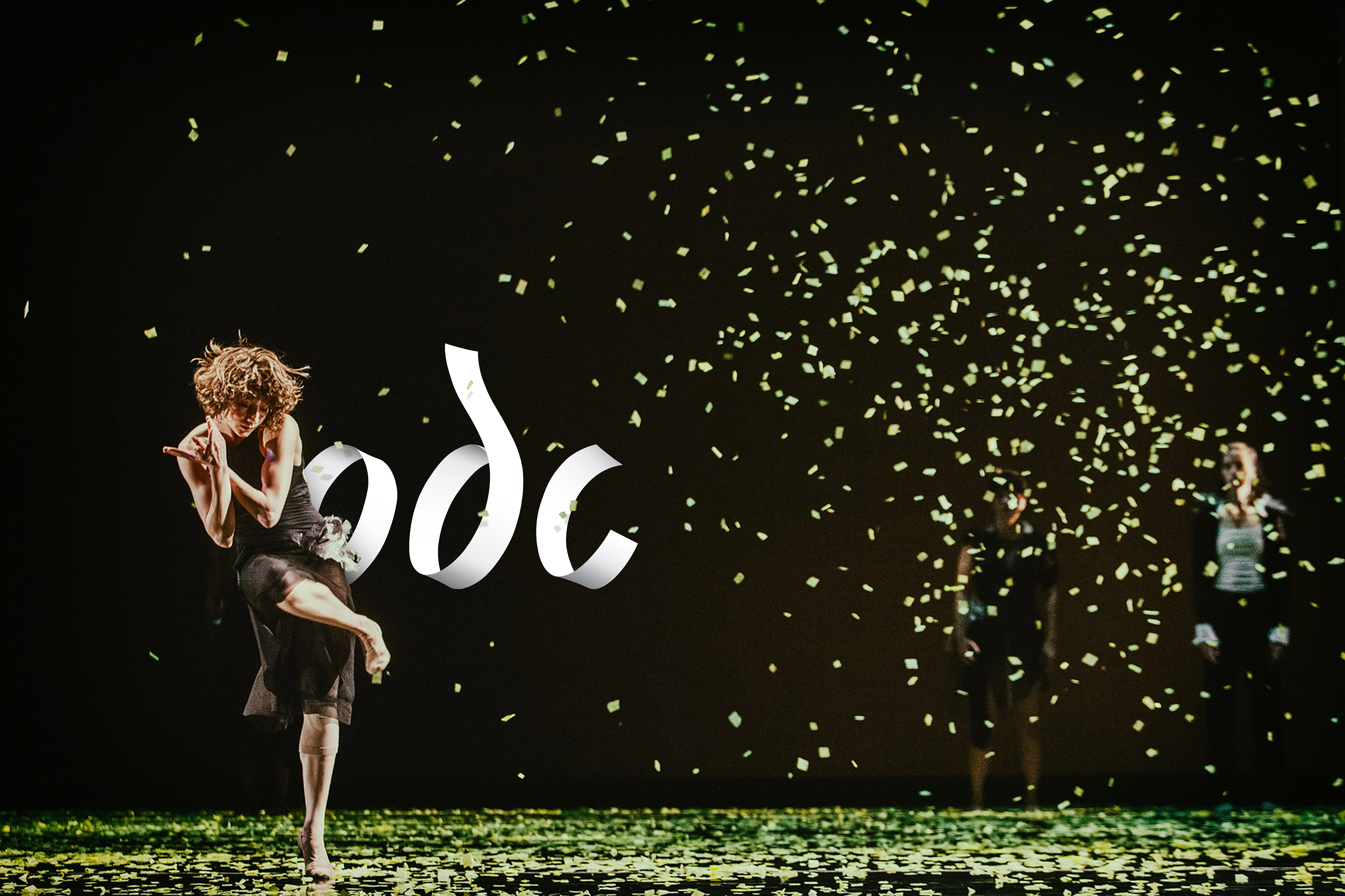
The Brief: Capture physical movement. Embrace human touch. Welcome everyone.
ODC is a contemporary dance institution rooted in San Francisco. It needed a new identity worthy of its unique voice and restless spirit. Born from the movement of paper lines and shapes moving through three-dimensional space, the identity curves and twists like a dancer. The new visual system unites three ODC organizations with radically different audiences—a professional dance company, a community-based school, and a performing arts theater—within one strong vision.
ODC is a contemporary dance institution rooted in San Francisco. It needed a new identity worthy of its unique voice and restless spirit. Born from the movement of paper lines and shapes moving through three-dimensional space, the identity curves and twists like a dancer. The new visual system unites three ODC organizations with radically different audiences—a professional dance company, a community-based school, and a performing arts theater—within one strong vision.
Roles: Logo Design, Visual Identity
Client: ODC Dance San Francisco
Studio: Landor
Creative Director: Carolyn Ashburn
Executive Creative Director: Mark Frankel
Motion Graphics: Britt Anderson
Awards: Graphis Gold, Print & Branding; Graphis Silver, Logo Design
Client: ODC Dance San Francisco
Studio: Landor
Creative Director: Carolyn Ashburn
Executive Creative Director: Mark Frankel
Motion Graphics: Britt Anderson
Awards: Graphis Gold, Print & Branding; Graphis Silver, Logo Design

Accenture Rebrand
Agency: Landor
Due to the sensitive nature of this content, it cannot be shared publicly. Please email me to request access to this project.
Agency: Landor
Due to the sensitive nature of this content, it cannot be shared publicly. Please email me to request access to this project.
Breathing new life into a historical arts venue

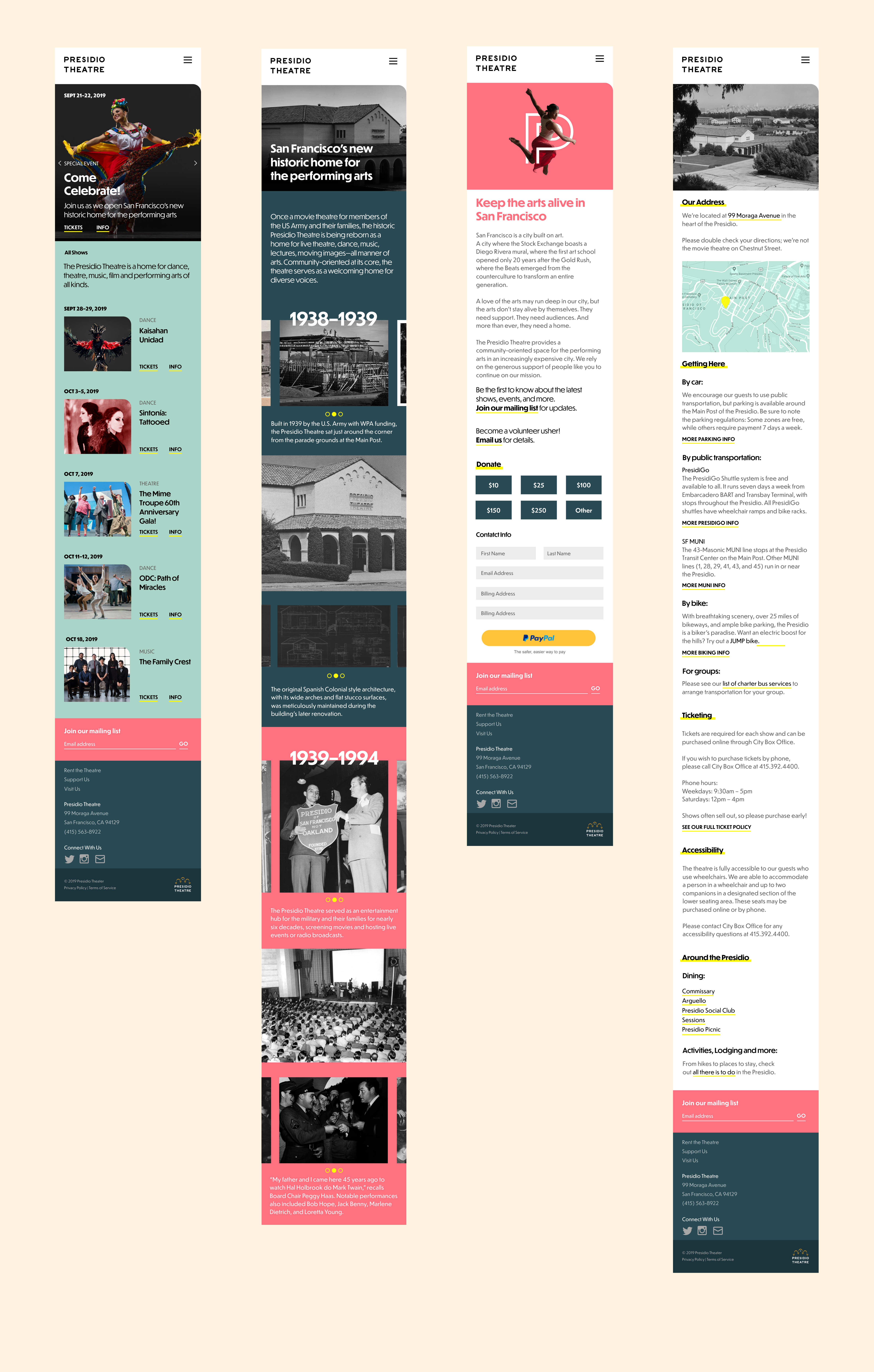
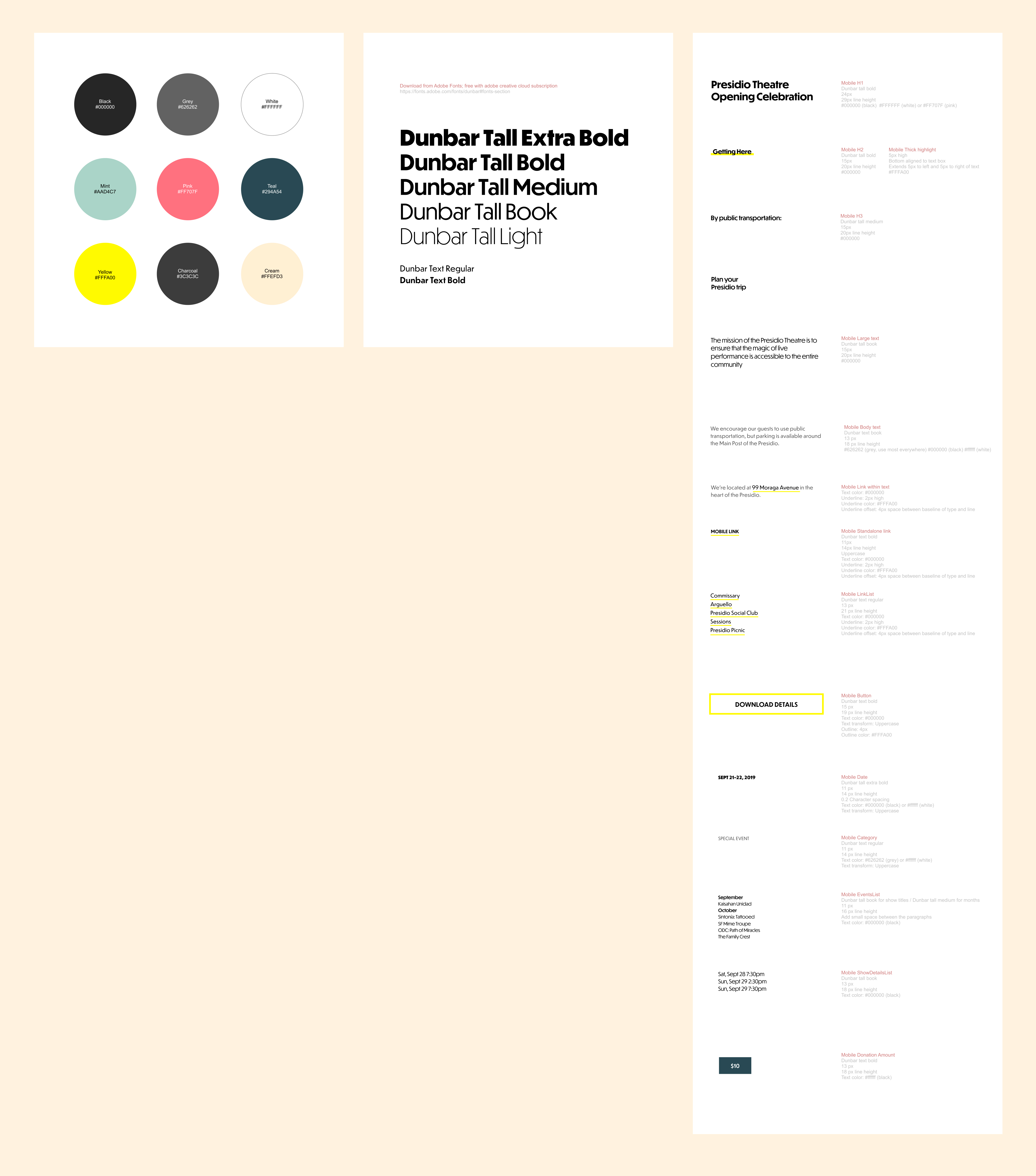
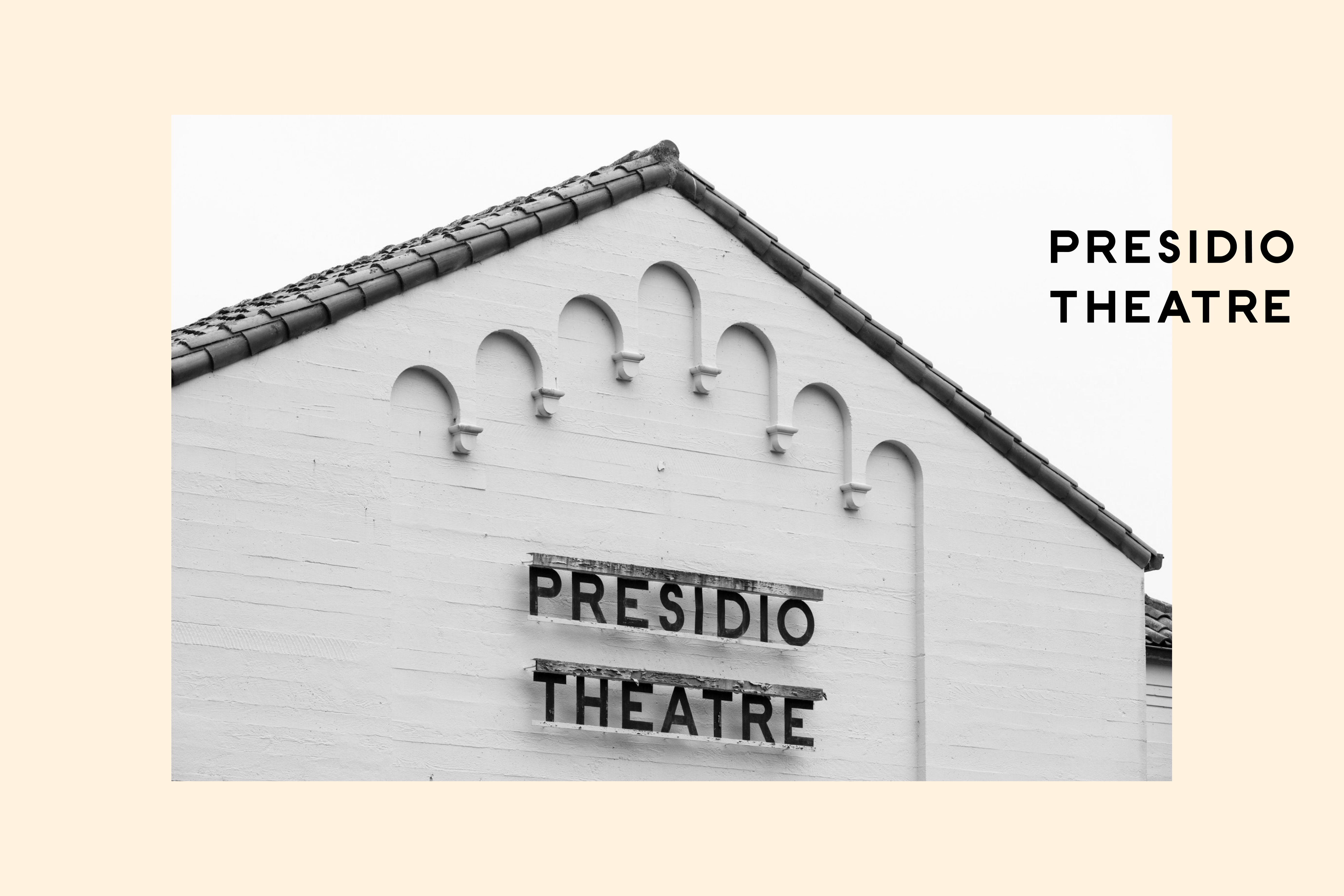
Built in 1939 and originally used as an entertainment venue for military soldiers, the Presidio Theatre came back to life in the fall of 2019 — after many years of disrepair and neglect. The theatre’s art deco-era bones were lovingly restored, opening to great fanfare and giving new life to an old space. The new mobile-first site tells the story of the space while inviting in a new generation of patrons to it’s dance, music, and theatre performances.
The main typeface, Dunbar, is itself a reinterpretation of the 20’s era Erbar-Grotesk. I recreated the theatre’s original signage for the site header.
Studio: I.D.W
Creative Director: Elina Frumerman
Art Director/Senior Graphic Designer: Leah Koransky
ECD: Leigh Okies
Writer: Cathy Bishop
PMs: Anna Acquistapace, Jaleen Francois
Designing a zine for waterpeople
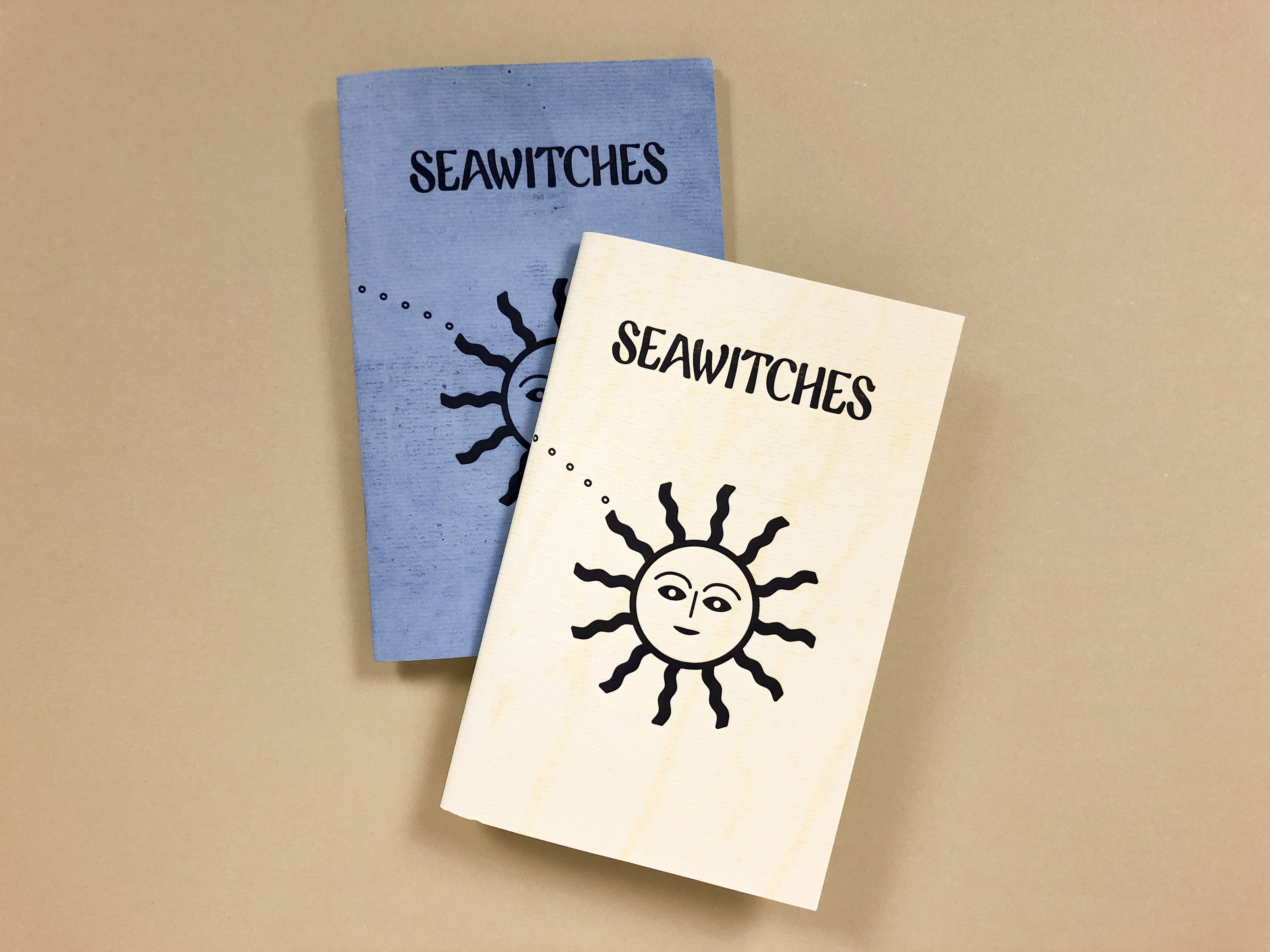
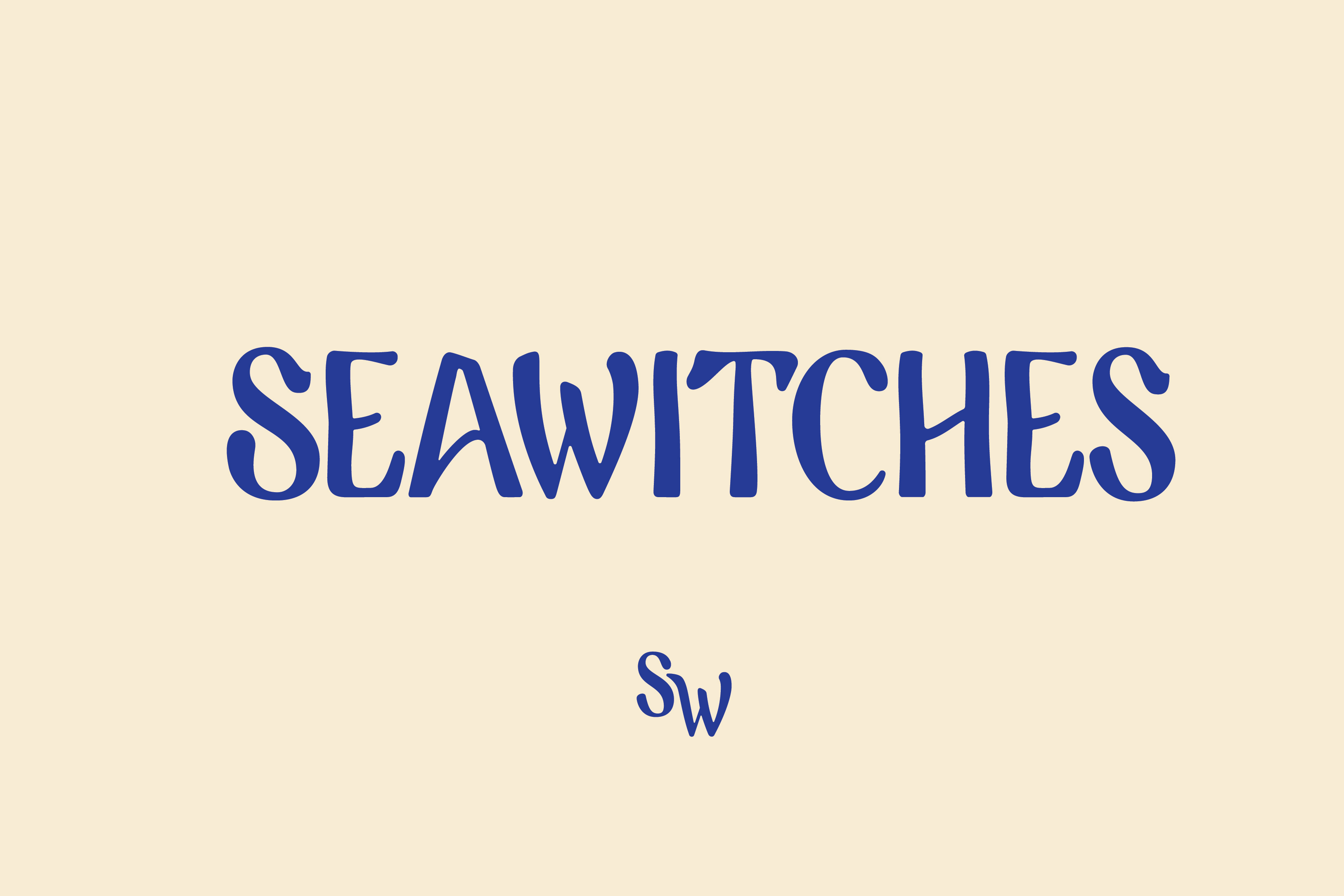
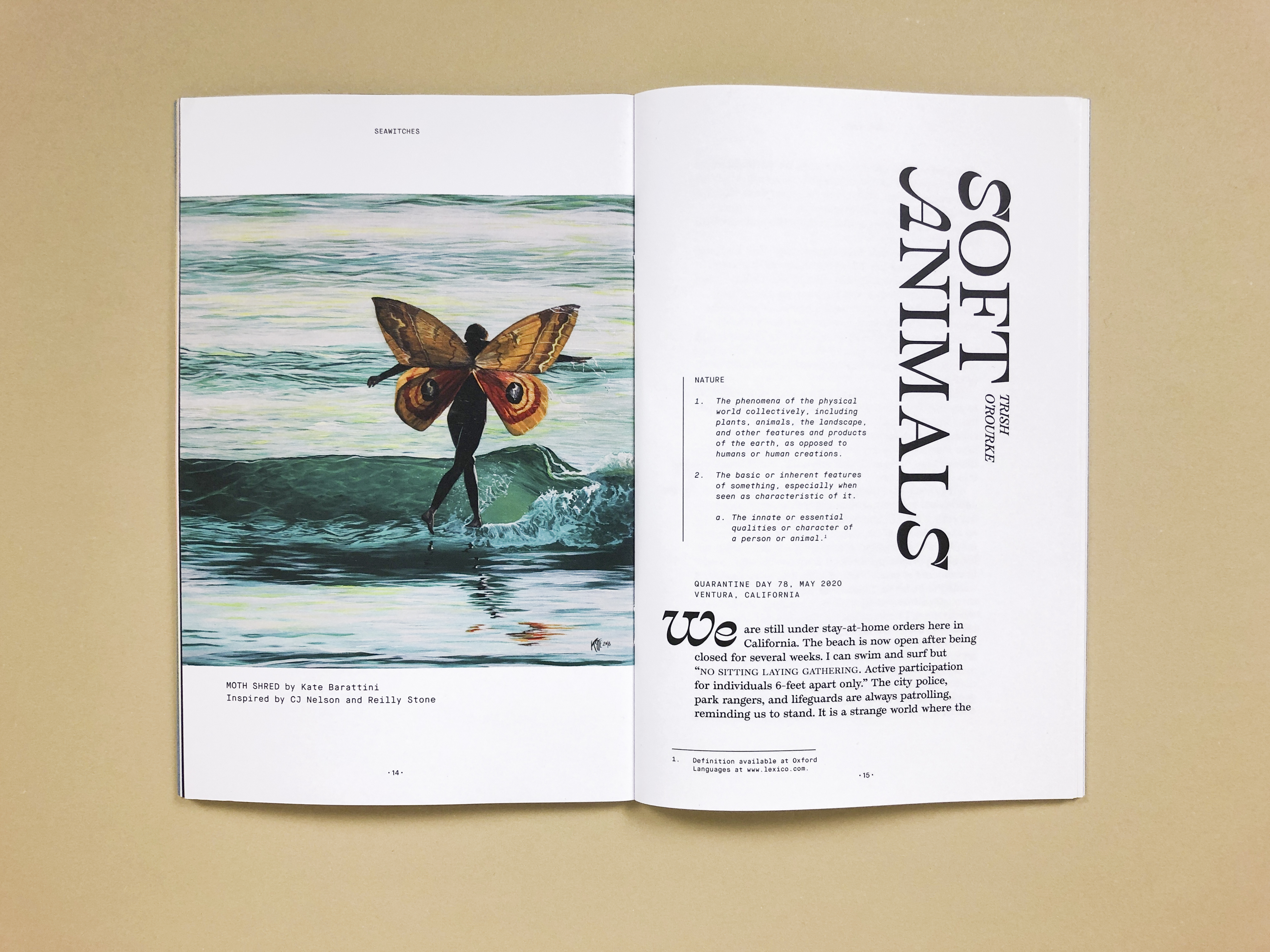

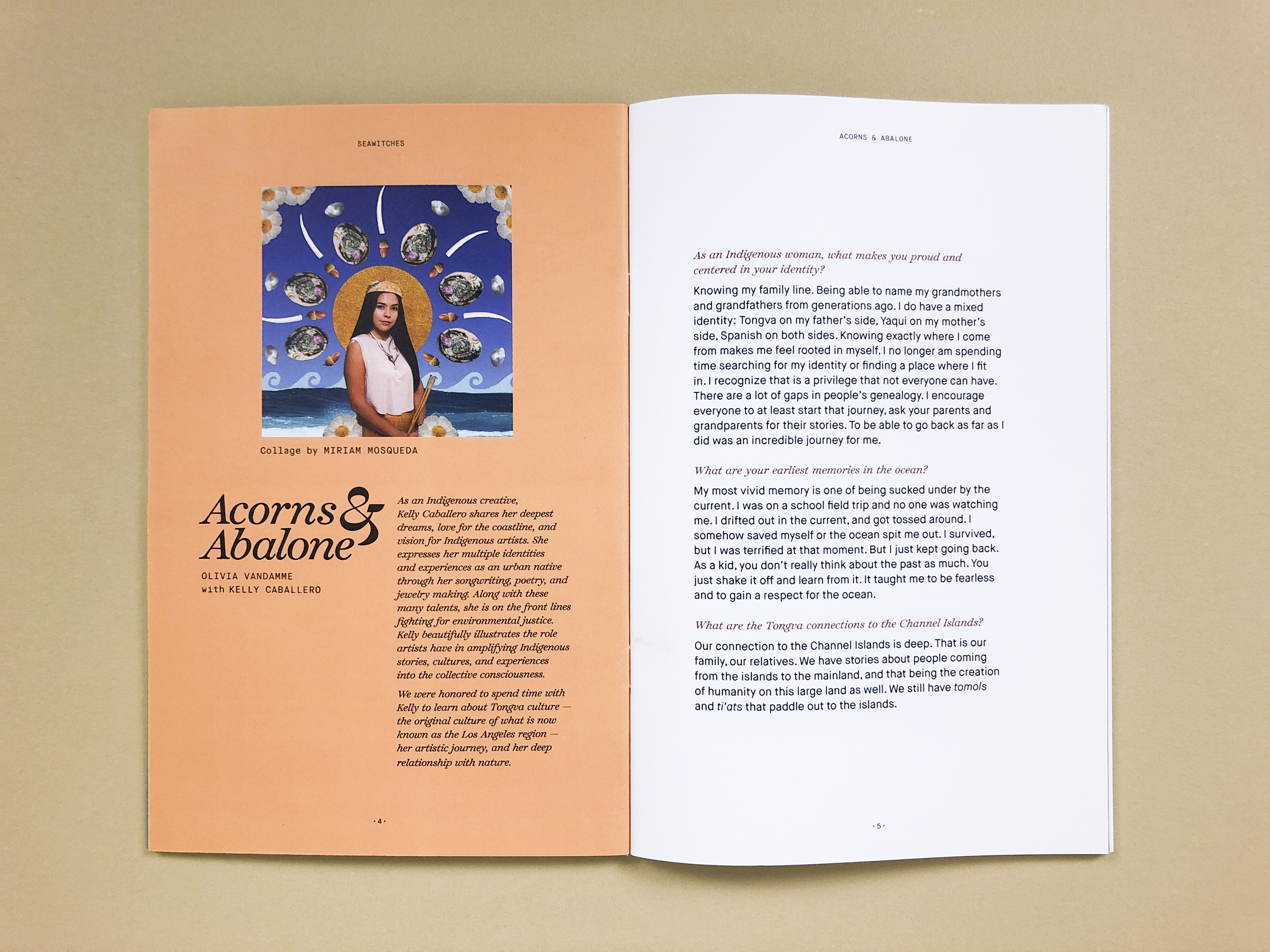
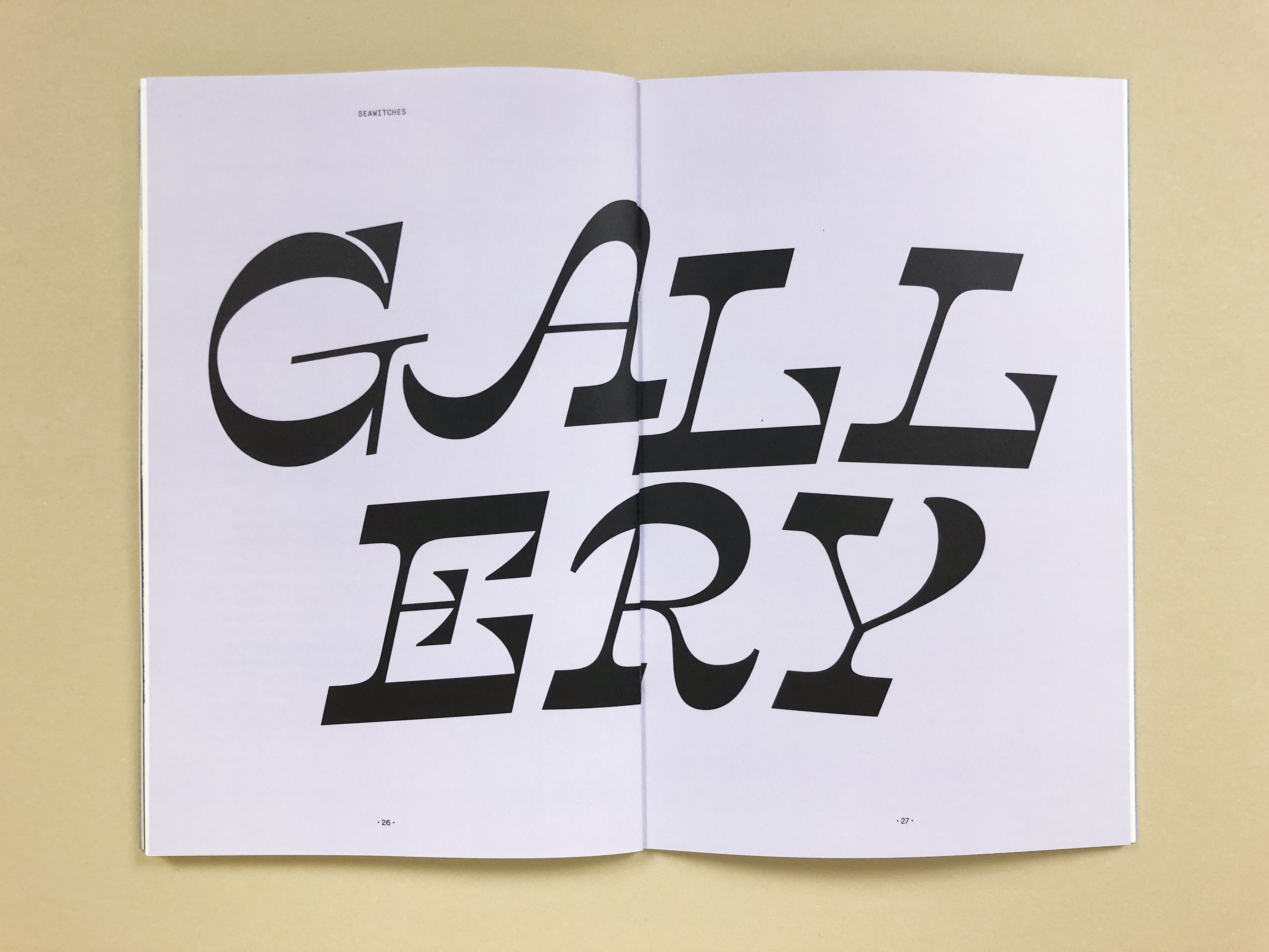
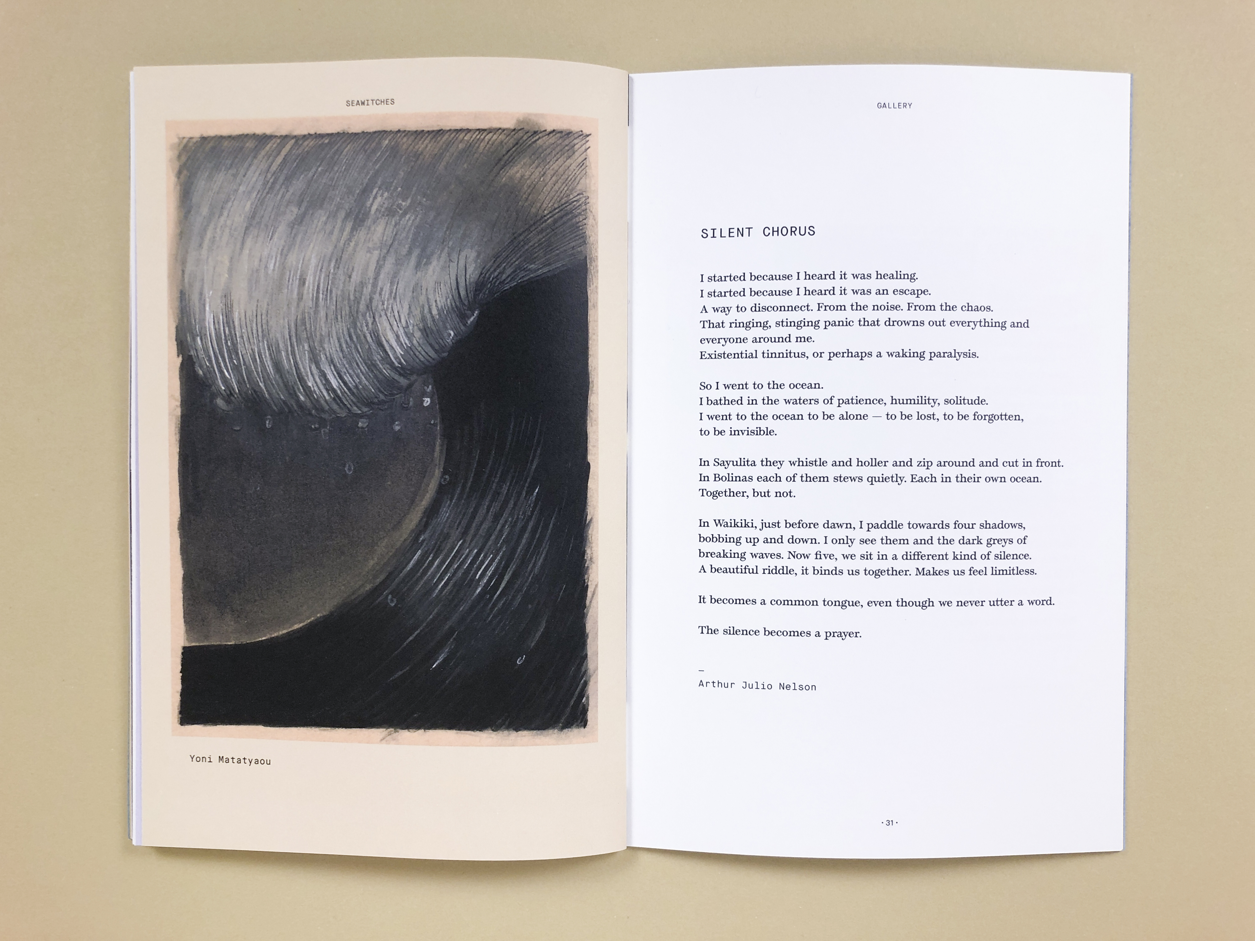
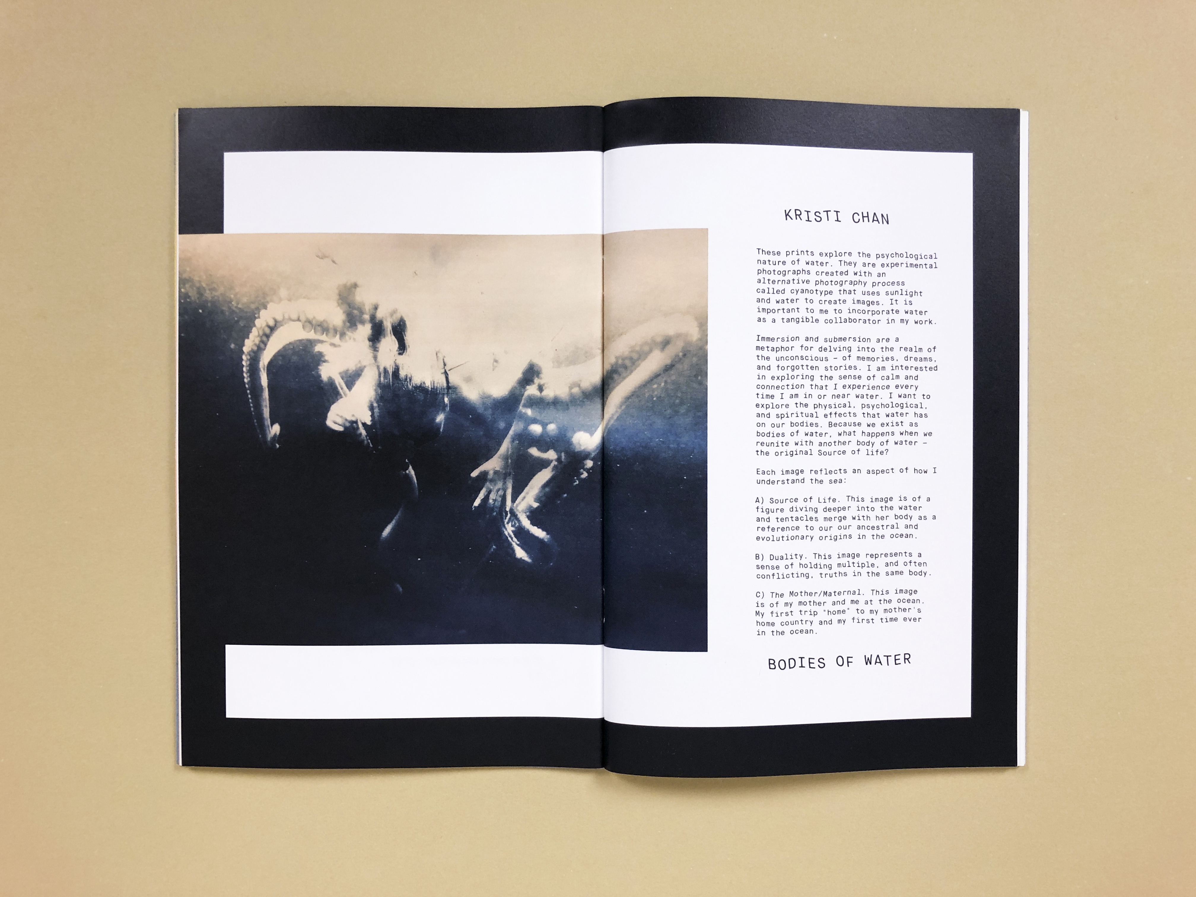

Seawitches, a zine for waterpeople, is a bi-annual print publication and platform for community building. Founded by surfer Margaret Seelie in 2015, the project exists to tell stories inspired by water.
As a community-based platform, each issue takes on the life of its contributors. I used the typeface Temeraire for narrative personal stories and Temeraire Italienne for display headlines throughout the zine. Additional copy is set in Maison Neue, Maison Neue Mono, and Recoleta. Designer Savannah Rusher created the custom Wetsuit Guide title treatment and illustrations.
I drew the Seawitches logo by hand; it references California surf culture, vintage paperback sci-fi and mystery novels, and psychedelia.
Reflecting the DIY spirit of the zine the covers are hand-dyed with botanical inks: the blue is indigo and the yellow is fennel and oxalis flowers.
See the fontsinuse.com feature ︎︎︎
Printed and bound by Colorprint in Burlingame, CA.
Covers letterpress printed at Open Windows Cooperative in San Franicsco, CA
Cover art by Cristine Blanco.
Creative Femme Ecofutures
![]()
![]()
![]()
![]()
![]()
![]()
![]()


Waters Run Deep is a group exhibition at San Francisco State University presented from August 10 through September 7, 2024.
The art direction compliments the overall themes: water, ecofeminism, ecofuturism, life and death, grief and healing rituals, and the grace and movement of dance. Tonally, the collateral reflects the video, performance, and still artwork on display: it is cinematic, otherworldly, powerfully feminine, magical realist, and emotionally poignant.
Curator’s Statement
Sixty percent of the human body is made up of water and seventy one percent of the Earth’s surface is covered in water. Water, in every shape and form, is a building block for life on Earth and its importance has been recognized by many, both in the physical by sustaining life, but also in the spiritual. Water is critical in many religious and spiritual practices around the world. This manifests as deities dedicated to bodies of water and rain, cleansing rituals, and the recognition of the integral connection of water and life.
The artists included in Waters Run Deep explore their own personal, cultural, and metaphysical connections to water. Featuring: Maëlis Bekkouche, Alexis C. Garcia, Lindsay Gauthier with Fog Beast, Tiare Ribeaux, Ana Paula Teixeira, Jessica Tully. Guest curated by Rogelio Cruz (San Francisco State University, B.A. 2024).
Roles: Art Direction, Photography & Design
Client: San Francisco State University Fine Arts Galley
Client: San Francisco State University Fine Arts Galley
Drawing Trees


I illustrated, designed, and co-wrote this book that encourages mindful guided tracing and observation of the natural world. I spent several months researching historical botanical drawings, nature guides from the last hundred years, and modern illustration and tracing books in order to create a range of shapes to trace. The book not only encourages mindfulness and careful noticing, it educates on the history and power of the trees around us. Thirty different tree species are represented, including pages filled with their leaves, branches and seeds. Inspiring quotes about the natural world are peppered throughout.
PRAISE FOR DRAWING TREES...
"I’m enchanted by “Drawing Trees,” an elegantly designed book from Leah Koransky....Part meditation guide, part botany lesson, this book is a little copse of peace in a chaotic world."
– The Washington Post Book Club
Drawing Trees can be purchased through Princeton Architectural Press or wherever books are sold.
Notecards that tell the story of a legendary author through color and pattern


This quote collection draws from all aspects of the life and work of celebrated author Virginia Woolf: letters to her loved ones, lectures, criticism, and, of course, her celebrated novels. The visual language was inspired by the textile designs of Woolf’s sister, the painter Vanessa Bell, as well as the patterned skirts and dresses worn by Woolf and the covers of her first editions. |
The first monograph for an influential artist and designer


Paula Hayes is a multi-disciplinary artist and designer, well known in the art world for her landscape designs and unusual hand-blown glass terrariums. This is her first monograph, published by The Monacelli Press.
Client: The Monacelli Press
In Situ Photos: Feather Weight
In Situ Photos: Feather Weight
Lunar Calendar


| For the new year, I wanted to create a printed gift that celebrated time and place in a unique way. I thought about things that have brought us together throughout the pandemic; we all share the moon and the stars. The two-sided calendar features the dates of 2022 full moons on one side, and new moons on the other side. Each full moon is accompanied by a corresponding folk name. |
Printed in Berkeley, California using a rainbow holographic foil stamp on extra heavy weight Colorplan 260 lb Ebony card stock.
5 x 7 in
Edition of 100
Graphic design at the intersection of craft & strategy
︎ leahkoransky@gmail.com
I began my career as an arts administration assistant at the Center for Photography at Woodstock in Woodstock, New York. Then, after traveling throughout the United Kingdom on a year-long work visa, I returned to school to study graphic design. My design career took me from San Francisco to New York and then back to the Bay Area. I currently work as an independent artist, educator, and designer out of my Berkeley, California studio.
My process is driven by curiosity and inspired by research, problem solving, storytelling, creative thought, systems, contemporary art, hands-on techniques, and collaboration. Oh, and I love type.
See my fontsinuse features ︎︎︎
As a full-timer and contractor I’ve worked with:
Adobe
University of Virginia
San Francisco State University
Airbnb
IDEO
Landor
Pentagram
Laird + Partners
Princeton Architectural Press
The Monacelli Press
Language Dept.
Resume available upon request
M.F.A., Interdisciplinary Fine Art
Concentration in Photography
San Francisco State University
B.F.A., Graphic Design with distinction
California College of the Arts
B.A., Studio Art
Concentration in Painting and Printmaking
Skidmore College
Semester in Painting and Printmaking,
Scuola Internazionale di Grafica,
Venice, Italy
Summer Studio in Photography,
School of the Art Institute of Chicago